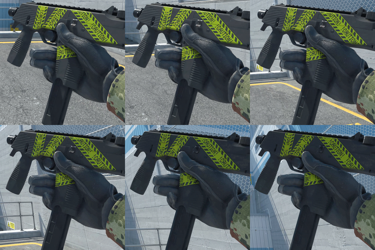
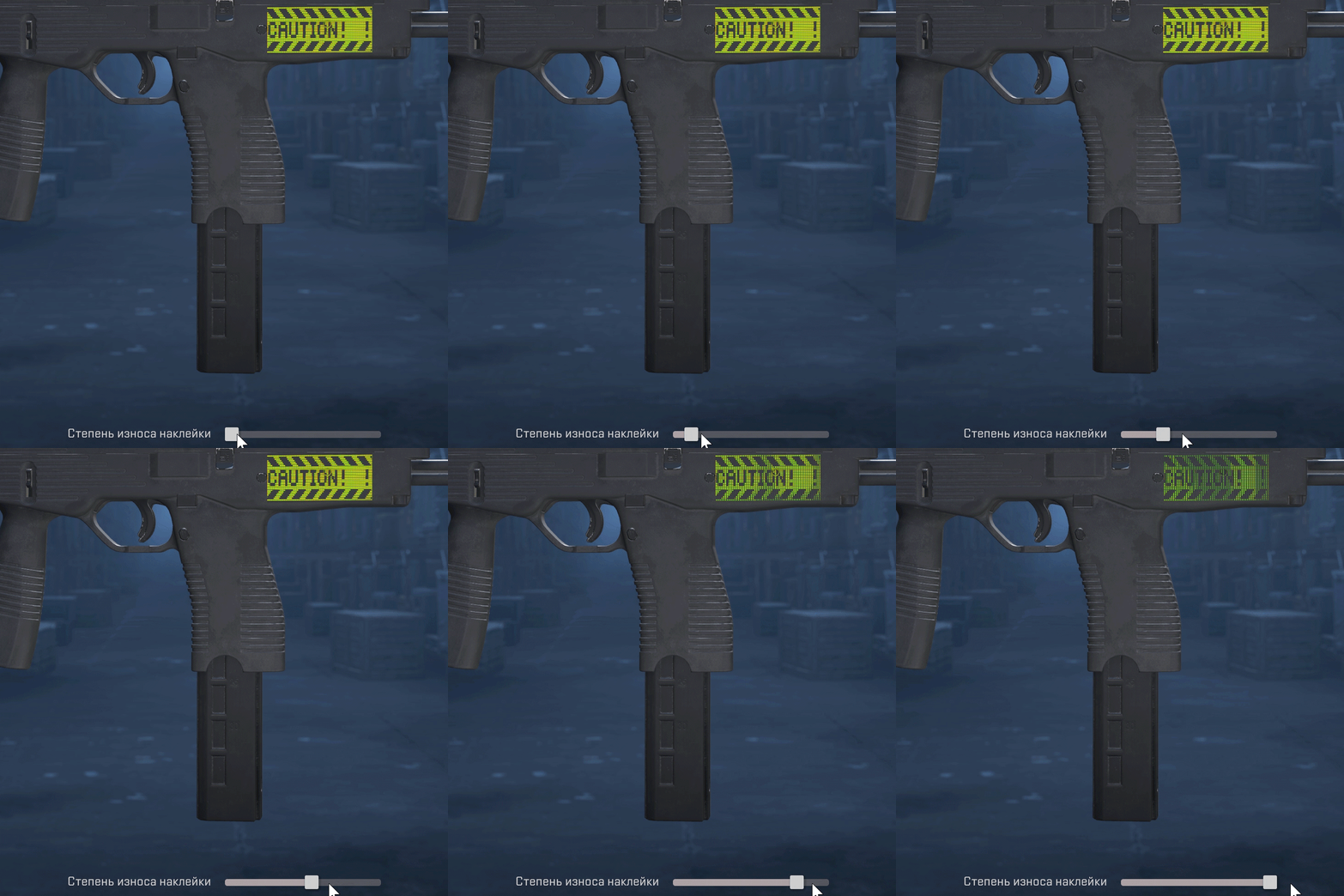
Stickers from the CS2 Workshop in Racing Theme. These will be added in the next update.
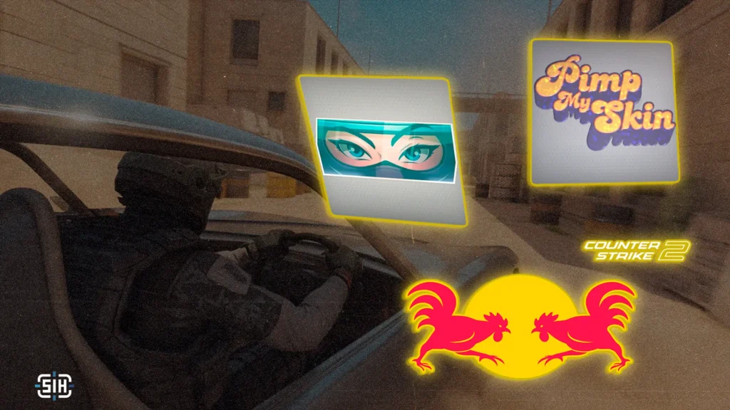
We continue to actively monitor the Steam Workshop and review designers’ competition entries. We’ve looked through thousands of works just in the racing theme, and in this article, we’ve compiled the 10 best ones that developers should definitely check out! When selecting candidates, we paid attention not only to appearance but also to the originality of the idea, its execution, and how well the sticker would look on weapons. Let’s see what designers surprised us with this time!
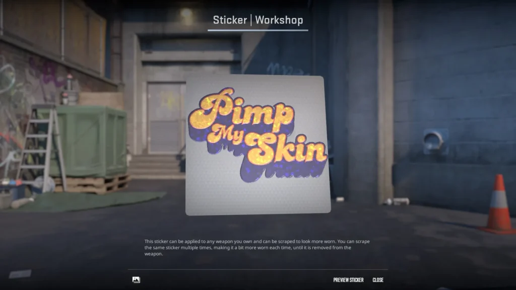
Sticker | Pimp My Skin (Glitter)
- by Crinjejeje
Puffy retro letters, warm gradient, and glitter create that very vibe of the show Pimp My Ride – loud, bold, and slightly tacky in a good way. It feels like you’re looking not at a sticker, but at a custom shop logo where every weapon is promised a second life and a huge monitor right on the bolt. The idea works on several levels: as a pop culture reference and as a metaphor for the skins industry. You’re not just sticking on an image – you’re “pimping” your weapon, choosing colors, placement, and combinations with other stickers. And if there’s any question about copyright, just remember the recent MVP sticker, which almost completely replicates the MTV channel’s style. Moreover, Pimp My Ride itself aired on MTV back in the day.
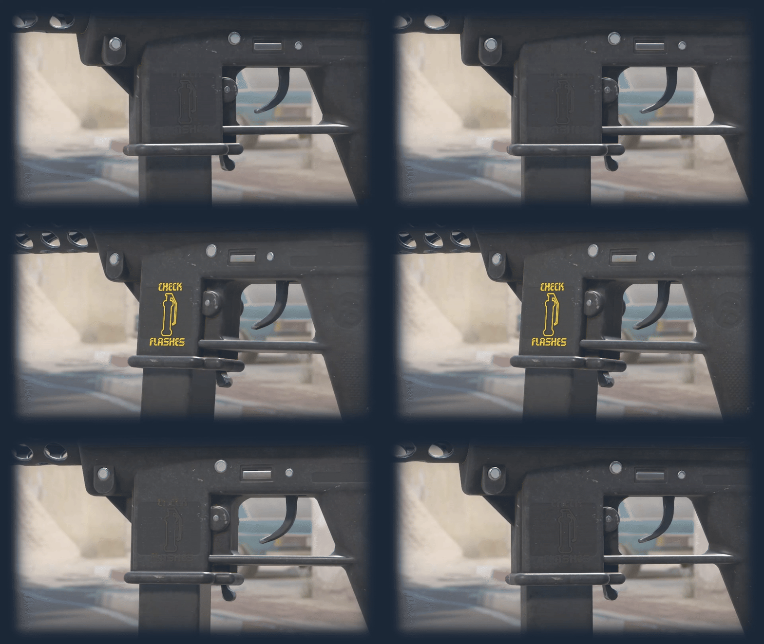
Sticker | Check Flashes (Lenticular)
- by Bayda
This sticker looks like a direct warning from a dashboard – that very moment when a warning indicator lights up and you instinctively start listening to every sound. The recognizable silhouette, strict form, and minimalism turn the sticker into a small danger sign that fits perfectly into the racing theme. Special charm is added by the lenticular effect: the image seems to come alive, changing with movement, like a real indicator on an instrument panel. The author openly admits this experiment became an important experience for them, and it shows – the design looks not just like a playful reference, but as a carefully thought-out mechanic where idea and technology work together.
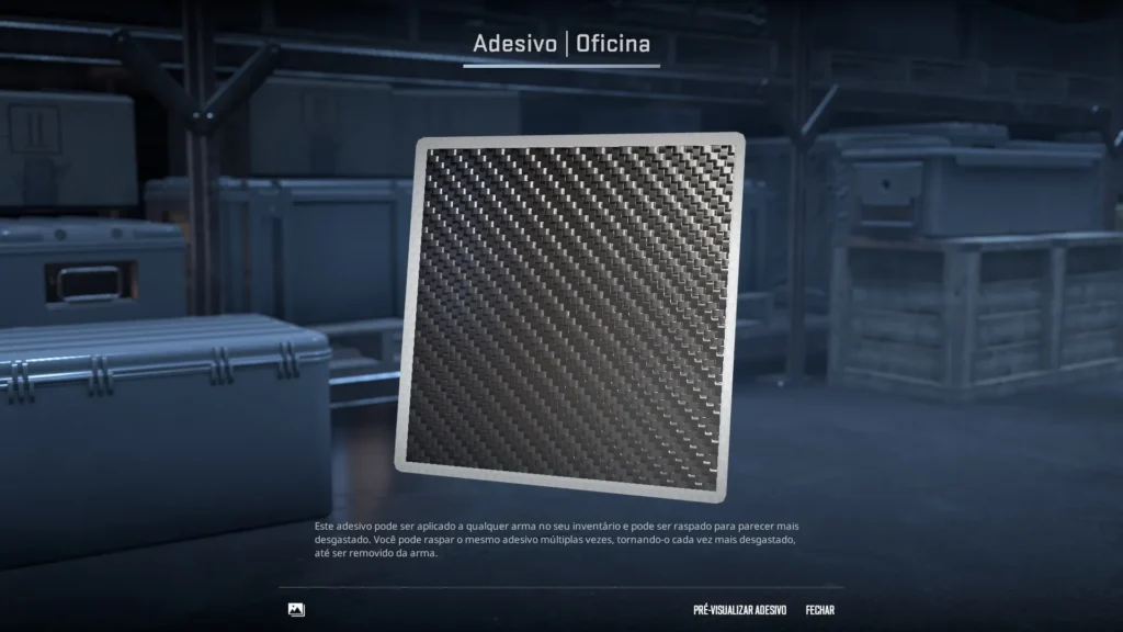
Sticker | Carbon Fiber (Foil)
- by kenN
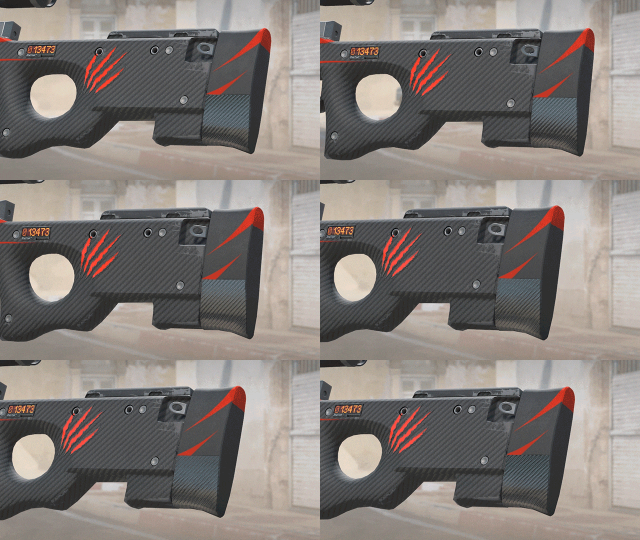
Sometimes a strong image doesn’t need inscriptions or characters – just texture is enough. This sticker is based on one of the most iconic materials in car culture: carbon fiber. Its recognizable weave has long become synonymous with speed, lightness, and expensive tuning, so in the context of racing theme, it feels maximally organic. The sticker works as a pure upgrade without extra noise. You’re not telling a story – you’re emphasizing the weapon’s character, adding that very “carbon layer,” like on a sports car hood. The sticker becomes analogous to a tuning detail: small but important, not immediately eye-catching, but changing the overall perception of the skin.
Sticker | Glance (Paper)
- by coooool 🤙🤙
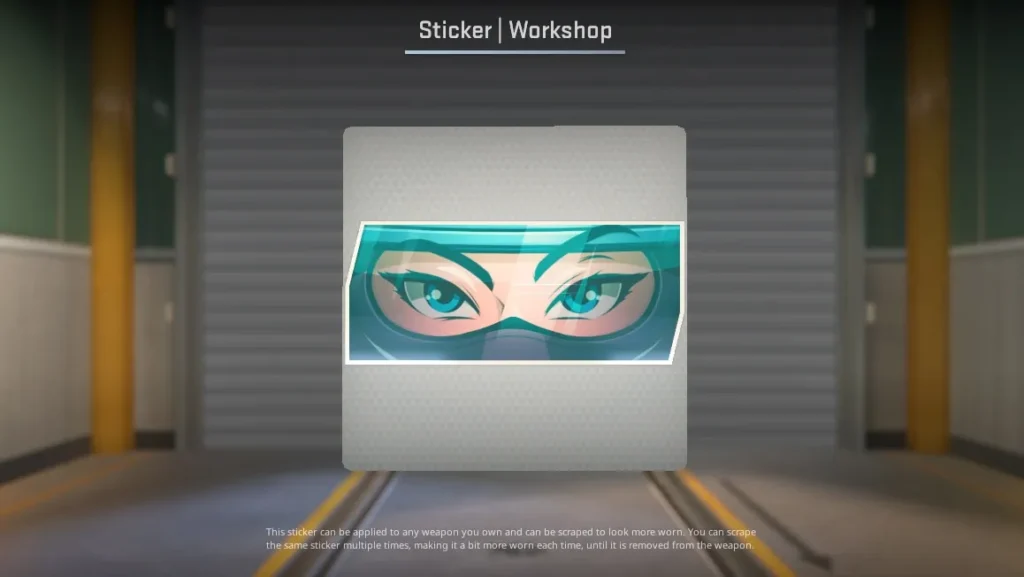
A look that hooks you from the first frame. Valve has long had a soft spot for designs with eyes, and Glance fits perfectly into this tradition: expressive, slightly squinted eyes, but now behind a helmet visor. Visually, the sticker is simple, but it’s in this simplicity that its power lies. Glance’s main feature is versatility. Such a sticker easily becomes part of any character on a skin: adds emotion, character, and a sense of presence. In spirit, it resembles Sticker | Loving Eyes (Holo), which sparked a copyright scandal at the time, and could well become its ideological successor – now wrapped in racing aesthetics. Minimum details, maximum expressiveness, and huge scope for creative crafts.
Sticker | Digital Dashboard (Lenticular)
- by Ezikyl
This sticker looks like a fragment of an instrument panel from a futuristic racing car or track supercar. Everything is simple, contrasting, and extremely functional, as it should be in a real racing interface. To enhance the effect, the author turned the sticker into a full-fledged mini-dashboard: there’s a speed indicator, selected gear, and a tachometer going into the red zone. Thanks to this, the sticker looks alive and dynamic. Due to the lenticular effect, the numbers start changing not from a sharp gas pedal press, but from a change in viewing angle. Digital Dashboard perfectly conveys the spirit of speed – the feeling that the weapon in your hands becomes part of the machine, and you yourself are sitting behind a virtual steering wheel.
Sticker | Licence Plate (Foil)
- by pirania_pl_
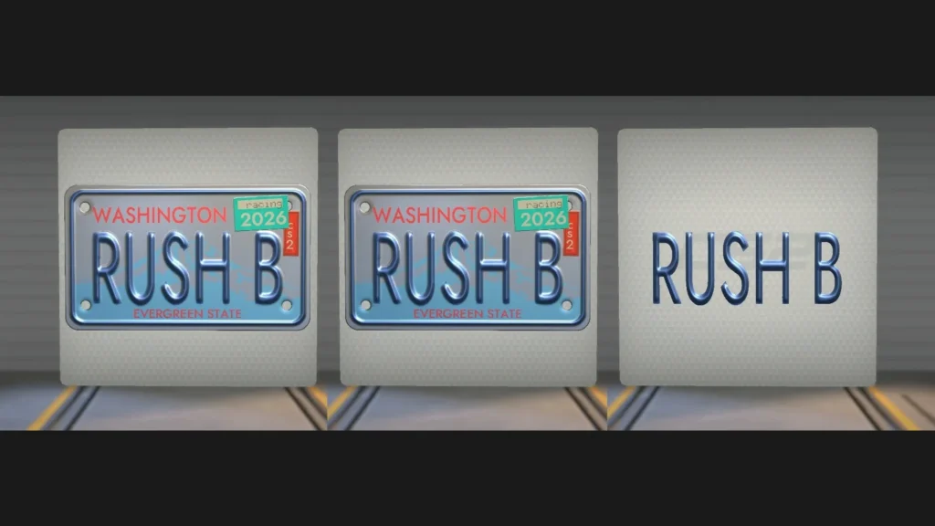
This sticker looks like a real license plate taken straight from a car bumper. Cold metallic shine, embossed letters, and neat rivets create the feeling of a physical object, not just a flat sticker. The inscription RUSH B turns the sticker into a witty bridge between car culture and CS terminology. On one hand – the feeling of speed, movement, and starting from a standstill, on the other – a recognizable phrase that has become a symbol of rushes and chaotic rounds. The result is a universal sticker that looks equally good both as a decorative element and as an ironic comment on the owner’s play style.
Sticker | Red Chicken (Paper)
- by lil POTATO
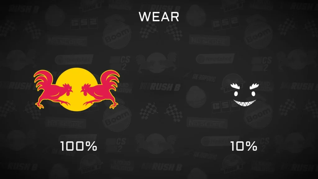
At first glance, you can read a bold and recognizable parody of the iconic energy drink logo that has long been part of esports and racing. But instead of aggressive bulls, here are two fighting chickens, and that’s where all the sticker’s charm lies. The author takes a familiar image and rethinks it through the lens of CS, where chickens have long turned into an unofficial symbol of the game. The result is a perfect hybrid of two worlds: racing culture and in-game memes. Red Chicken looks bright, readable, and works great as an ironic accent on any weapon.
Sticker | Tire Tracks Bullet (Paper)
- by SHAFT 🎫
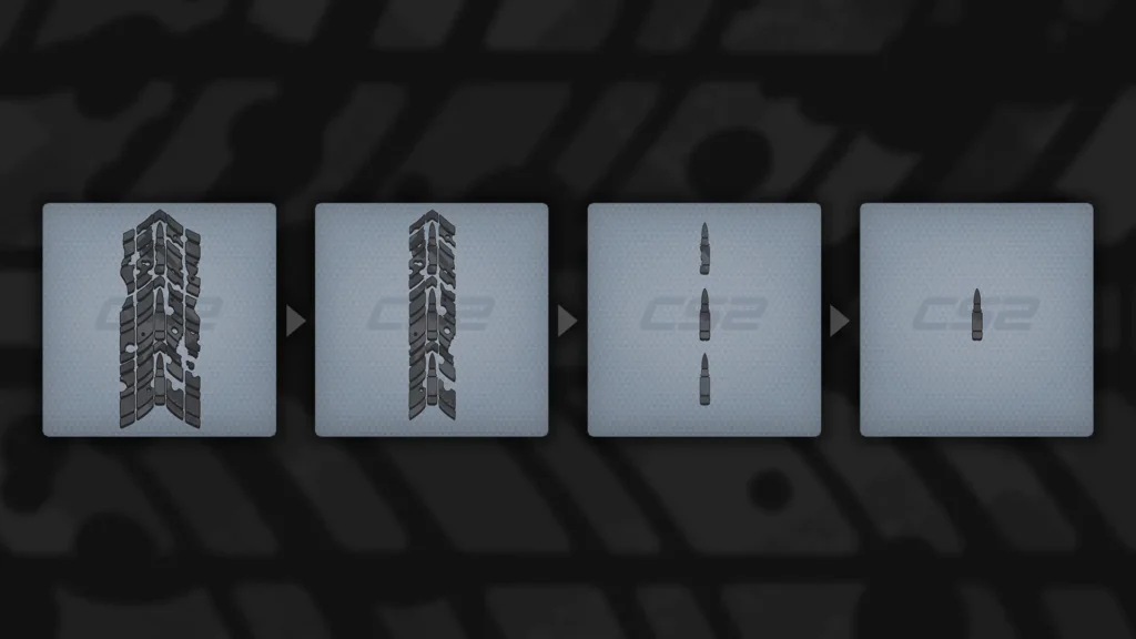
Here the author approached the idea not just as an image, but as a small story. In its original form, the sticker resembles fresh tire tracks – rough, torn, as if left by a sharp start on asphalt. But as it wears down, these fragments gradually disappear, exposing the central bullet silhouette, as if a pure form is born from the chaos of mechanical details. This wear effect turns the sticker into a dynamic object: it literally “evolves” along with the weapon.
Sticker | !CAUTION! (Lenticular)
- by oKeyush
A warning tape, as if torn from an industrial zone or restricted area, fits perfectly on the weapon body, turning it into an object with character. Acid-yellow color and pixel design create the feeling of a digital display or old LED screen, where the word CAUTION! flashes as the last warning before chaos. This isn’t just a sticker – it’s a visual alarm signal. The lenticular effect adds magic: depth and texture perception change with movement. In the end, you’re left with the feeling that the weapon has been through dozens of battles and no longer needs signs – it itself is the danger.
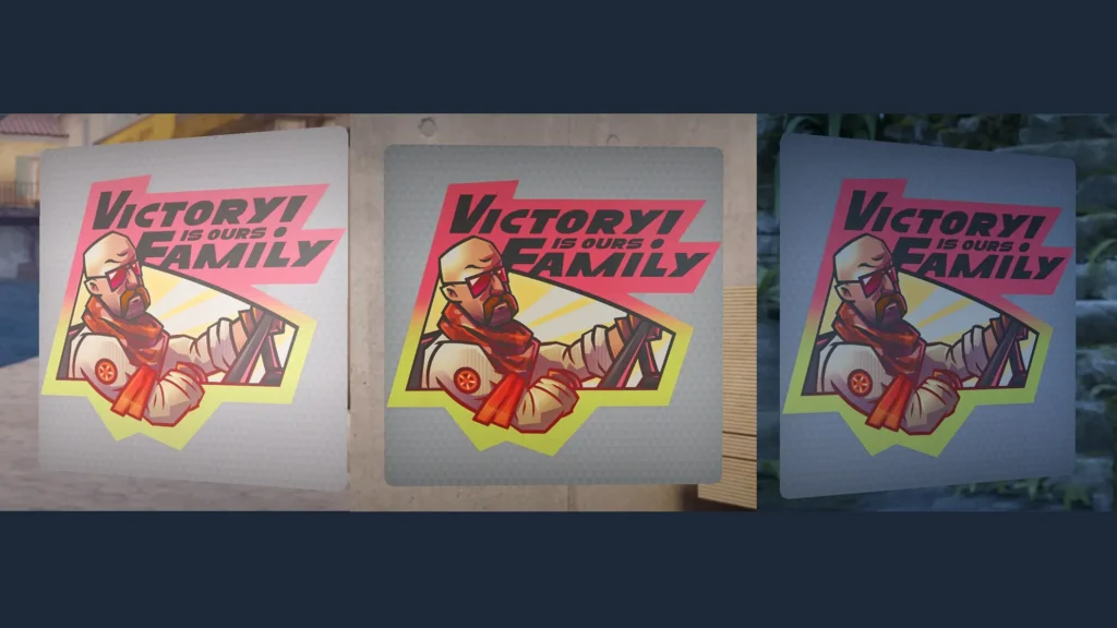
Sticker | Family (Paper)
- by danz
If there’s a word holier than “speed” in car culture, it’s definitely “family.” This sticker is a direct and ironic nod to the Fast and Furious film series, where any problems are solved either by drifting or family bonds. Bright poster style, juicy outlines, and a bald protagonist in sunglasses look like the cover of an alternative Fast and Furious spin-off in the CS universe. The sticker plays on a recognizable meme, but at the same time fits perfectly into the overall racing aesthetic of the collection: as if the weapon is another team member, where victory is always “ours” and always for the family.

Author: Alex
Alex is an author and esports observer with more than seven years of experience. He specializes in analyzing new releases in the world of computer games, gaming services, and in-game economies. Alex shares practical experience and an expert perspective on the development of gaming, helping readers understand complex mechanics and stay up to date with the latest news.
