Fruit Drop from the Steam Workshop: 10 Stickers That Could Make It Into the Game as Early as March 2026
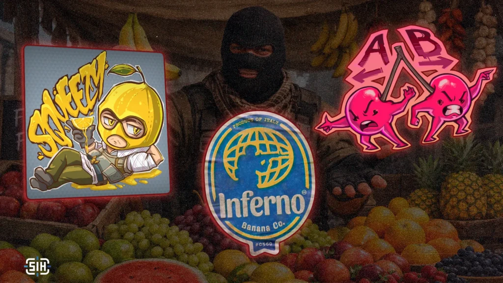
Valve has announced a submission deadline of March 13 for their new skin and sticker competition. This means the Workshop is currently being filled with fresh concepts, among which you can find truly original ideas that might one day appear in the game. We’ve already published several themed roundups, and this time we’ve compiled 10 stickers on the theme of fruits and vegetables – the first collection of its kind. There’s humor, style, and designs that look ready to ship. Let’s go!
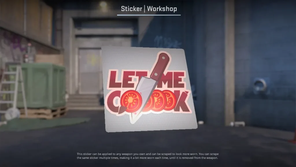
LET ME COOK (Paper)
- by coooool
At the heart of this sticker is the popular phrase “Let me cook,” which has long circulated in the gaming community as a playful expression before pulling off something epic. The creator took it literally: instead of an abstract metaphor, there’s an actual kitchen – a knife, tomato slices, and lettering that looks like it was cut from a sauce package or a spice jar label.
The design is clean and simple: a soft color palette, smooth shapes, and juicy red accents give it the feel of a grocery store sticker. It’s not cluttered with details, reads well on weapons, and has a very clear concept.
Chilli Love (Glitter)
- by SirPendracon
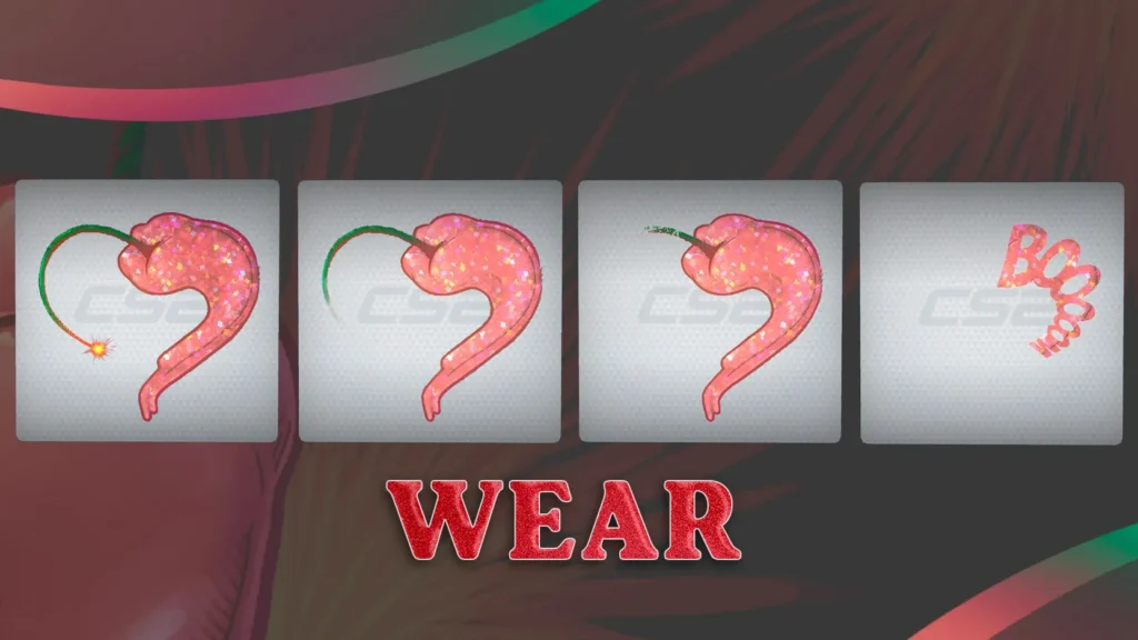
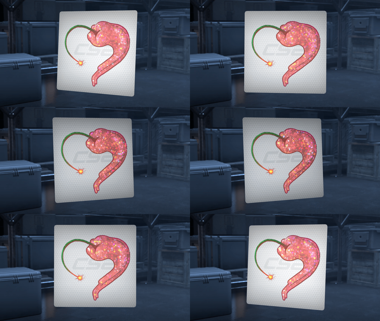
The creator turned a chili pepper into a miniature bomb – a fuse, a spark, and a shape reminiscent of an explosive charge make for a simple but very effective visual pun. The idea lands instantly: the pepper’s heat is conveyed through the familiar silhouette of dynamite.
The red glitter shimmers and resembles either a sugar glaze on a dessert or lacquer on decorative enamel. Thanks to its rich color and clean shape, the sticker will fit into many skin designs. The wear stages are a nice touch too: as it degrades, the fuse and small details gradually disappear, leaving a neat pepper silhouette with the word “BOOM.”
Fruit Slicer (Lenticular)
- by 🍀toxic³⁴²
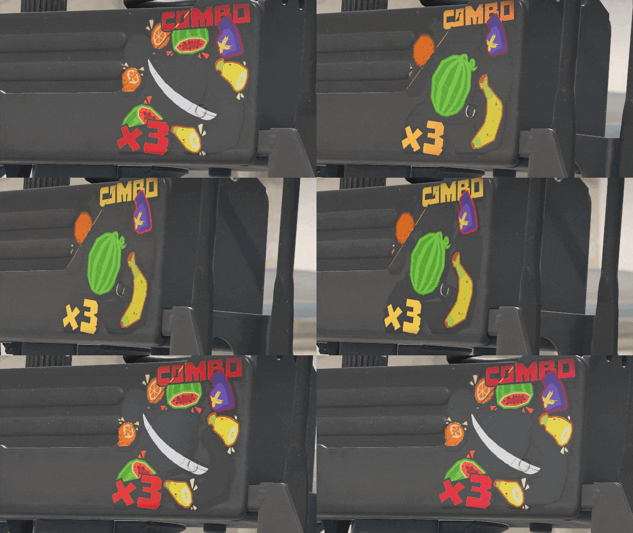
The sticker is built around a familiar visual – slicing fruit mid-air, which immediately brings to mind arcade mobile games like Fruit Ninja. Within the CS universe itself, this motif has long existed: on maps like Inferno or Italy, you can stage an improvised “slicing session” by knifing fruits lying around. The creator neatly blends both references into a single sticker.
The key feature is the lenticular effect. As the weapon moves, the frames shift and the fruits appear to fly apart from the blow, turning the sticker into a mini-animation. Thanks to the bright colors and simple object shapes, the composition reads well even in motion, and the movement effect makes it more than just decoration – it’s a tiny scene right on the weapon’s surface.
EZ – Lemon Sticker (Paper)
- by polo mono
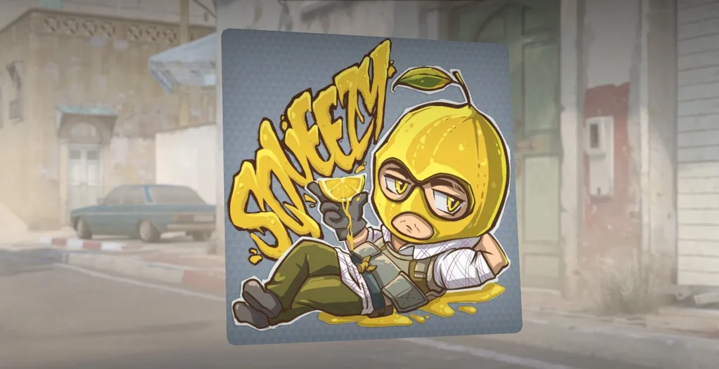
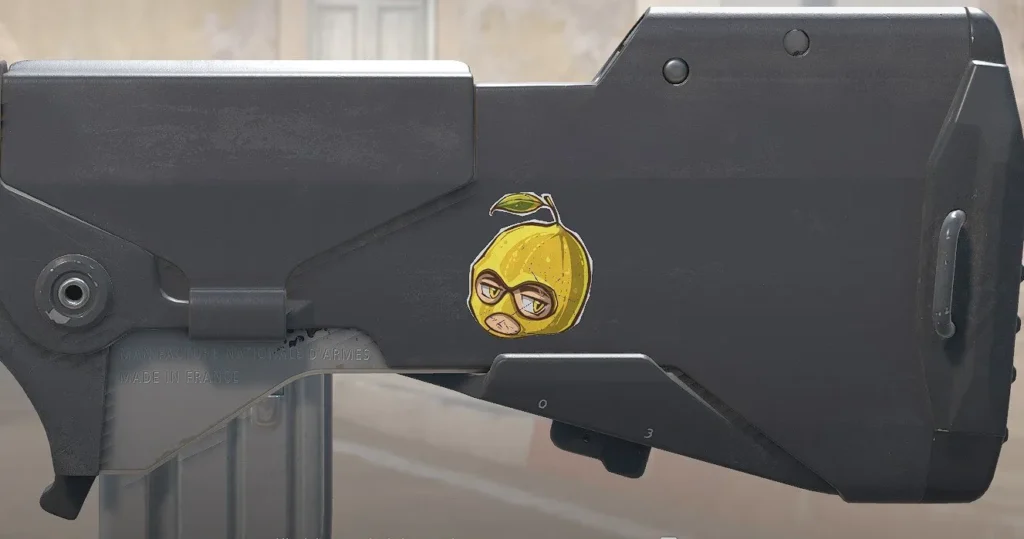
The phrase “Easy-peasy lemon squeezy” is one of the most recognizable gaming expressions, so the idea of playing on it through a lemon is pretty obvious. But the creator went beyond a simple pun and crafted a full mini-story: a character in a lemon mask lounges in a puddle of juice, squeezing a wedge that visually resembles a cocktail glass.
The sticker feels lively thanks to its combination of soft lines, cartoonish style, and a rich yellow color that immediately catches the eye. The lettering is done in the same “juicy” style, as though squeezed out of a citrus, which adds to the overall cohesion. Among all the obvious lemon-themed ideas, this one stands out for its execution – not just a joke, but a neatly composed little scene.
Last Bite (Glitter)
- by Medoyed
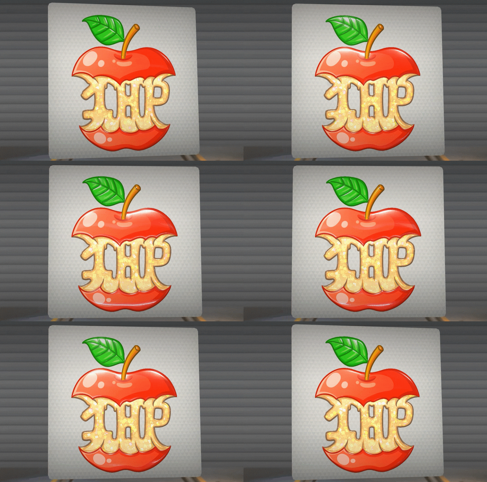
The sticker centers around a simple but expressive image – a bitten apple with “1HP” written inside instead of the core. The contrast between the appetizing, glossy skin and this universally recognized gaming label creates an intuitive association: the fruit has “survived” down to its last hit point.
The glitter texture makes the inner part especially eye-catching – the golden shimmer resembles a caramel filling, drawing your gaze to the center of the composition first. Clean outlines, a rich red color, and a concise concept help the sticker look neat and pair easily with a variety of skins without overwhelming them visually.
The Orange Valve (Foil)
- by Crinjejeje
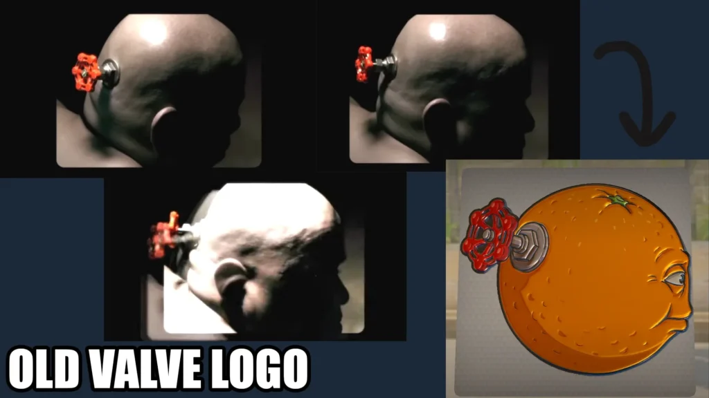
Some ideas work without any explanation – a single glance is enough. Here, the creator takes the iconic old Valve intro and reimagines it within a fruit theme: instead of the head with a valve, there’s an orange with that same metal tap. The result is simultaneously a parody and a subtle nod to a classic.
The foil finish amplifies the effect – the surface shimmers as if the peel were lacquered, and the metallic valve details look even more striking. This sticker will especially appeal to those who enjoy hidden gaming references: for some it’s simply a stylish citrus, but for the observant, it’s a small visual wink at the universe of Half-Life 3 rumors.
Broco'Bomb (Embroidered)
- by 𝙍aska 💚
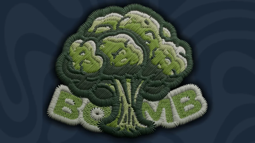
Here, broccoli is transformed into the silhouette of a nuclear mushroom cloud, and the shape similarity works so precisely that the concept registers instantly. The creator doesn’t overcomplicate the composition with unnecessary details and relies entirely on the visual analogy – the rounded “cap,” the dense texture of the florets, and the stem come together into the unmistakable silhouette of an explosion.
Particularly interesting is the Embroidered format. The surface looks like genuine thread embroidery: visible stitches, volume, and soft gradations of green. Currently this style is only seen on stickers from the StarLadder Budapest Major, so using it for a regular collection feels especially fresh.
Vitamin X (Paper)
- by emLeftorRight?
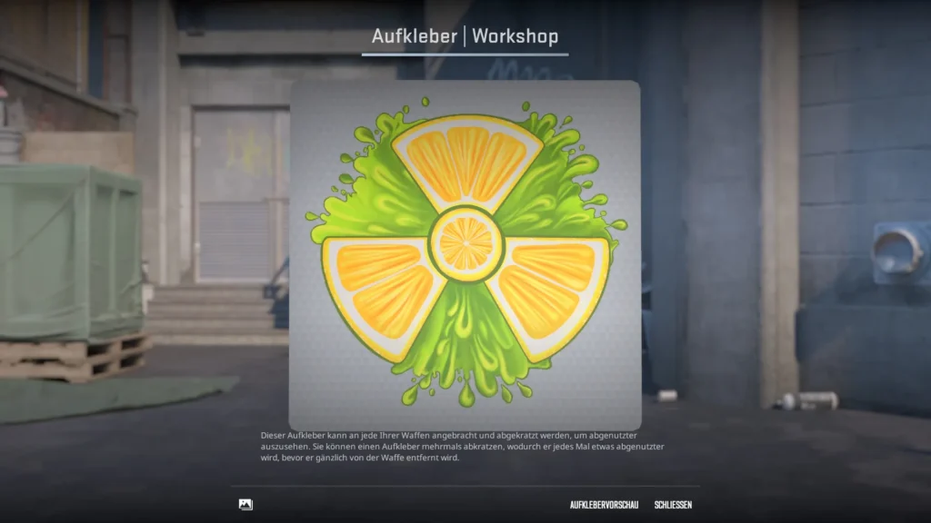
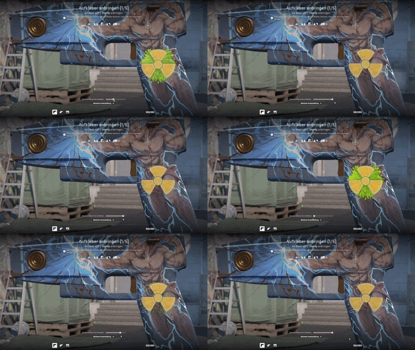
The bright citrus symbol with neon-green splashes looks like it was cut straight from an energy drink can and slapped onto a weapon. The central lime disc and four surrounding segments create a shape reminiscent of a radiation symbol – except instead of danger, it’s pure visual energy.
This design will fit into a wide range of weapon combinations and will work especially well in brightly themed loadouts. The addition of a sticker like this will stir particular excitement in the community, which is already buzzing with anticipation for the upcoming Cache map release.
Cherry Split (Paper)
- by BLÅHAJ
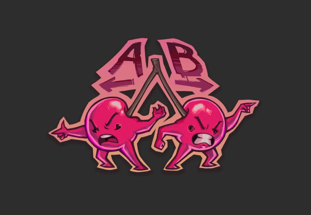
A fun illustration featuring two angry cherries connected by a single stem, playing on the classic player dilemma of choosing a plant site. The characters pull in opposite directions, seemingly arguing over whether to go A or B – and thanks to this, a simple concept comes across as lively and humorous.
The bright pink palette and bold outline make the sticker stand out even on busy skins, and the cartoonish style pairs well with both neon designs and more minimalist weapon aesthetics.
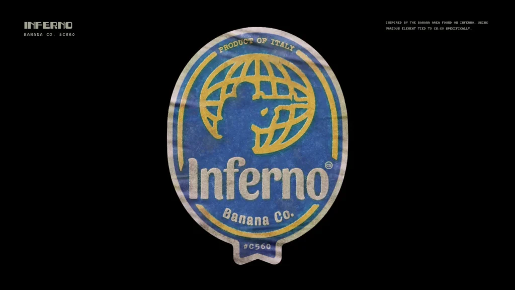
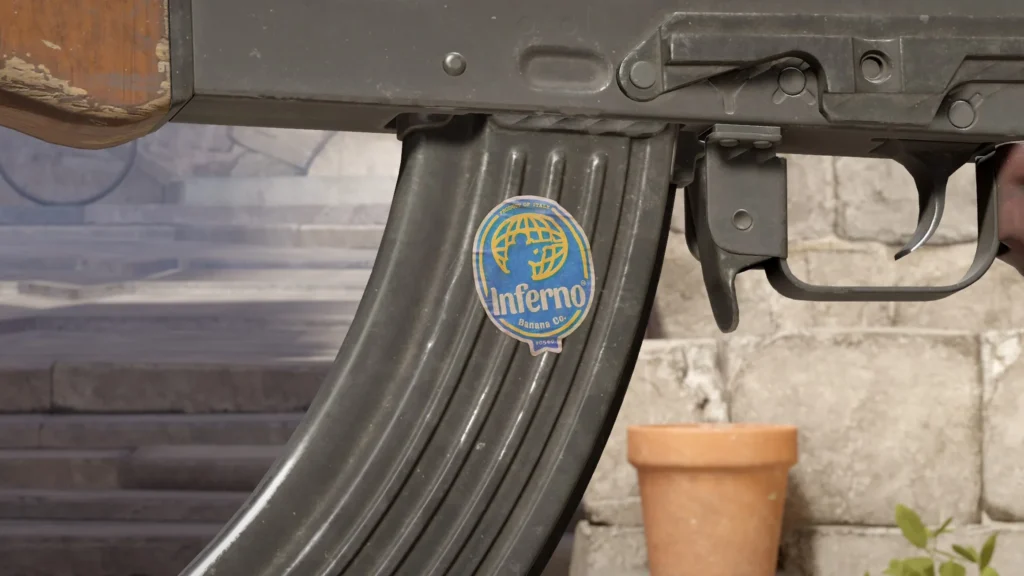
Inferno Banana Co. (Paper)
- by dwern
And of course, what would this be without a banana on Inferno. Among the many works on this theme, this particular design stands out for its neat vintage fruit label styling. It resembles a classic sticker from a crate of imported bananas: a muted palette, a subtle worn effect, and clean typography give the impression that it actually arrived straight from a warehouse. Thanks to its calm tones and clean form, the sticker looks restrained and aesthetic, making it easy to work into a wide variety of crafts.

Author: Alex
Alex is an author and esports observer with more than seven years of experience. He specializes in analyzing new releases in the world of computer games, gaming services, and in-game economies. Alex shares practical experience and an expert perspective on the development of gaming, helping readers understand complex mechanics and stay up to date with the latest news.
