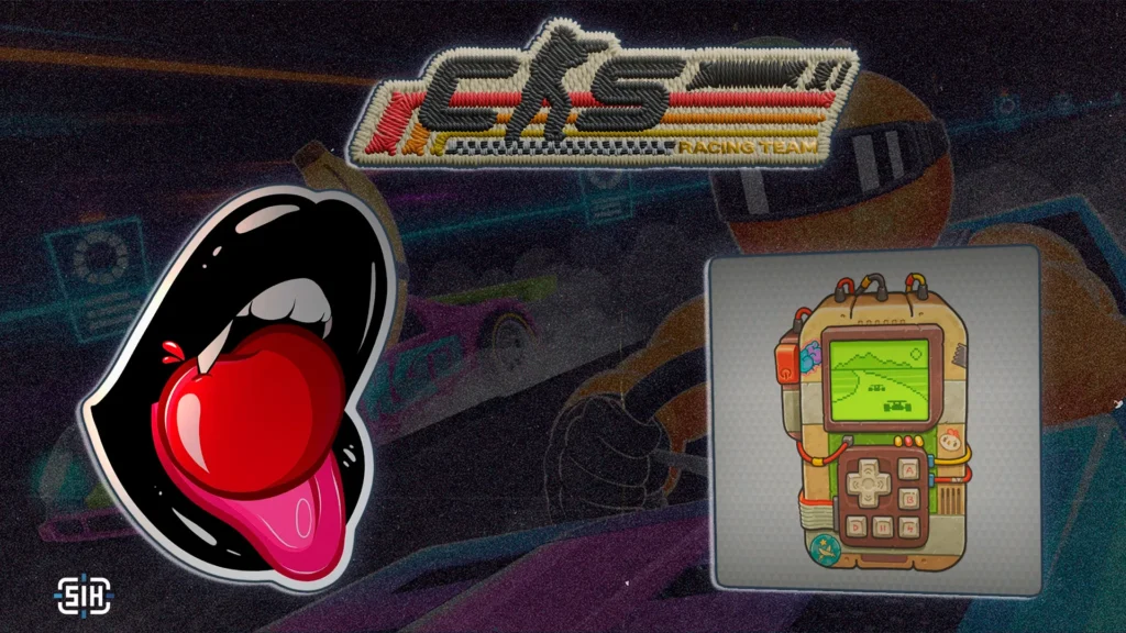
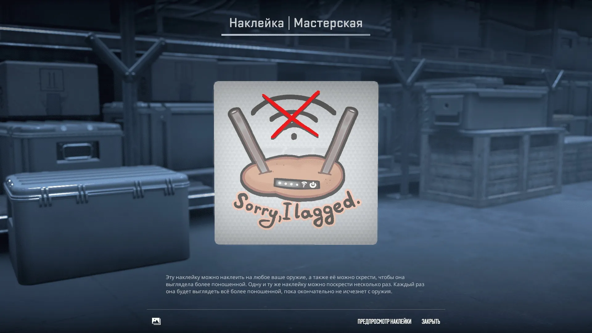
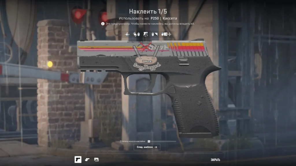
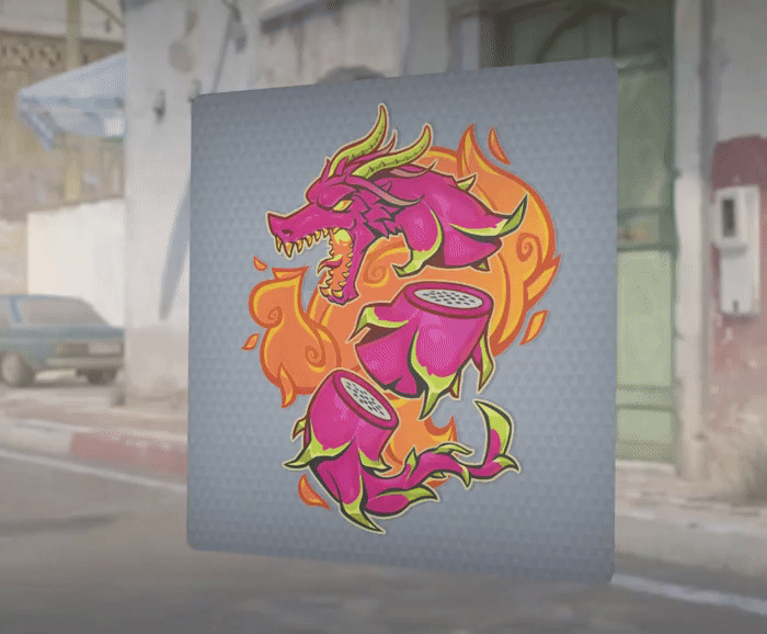
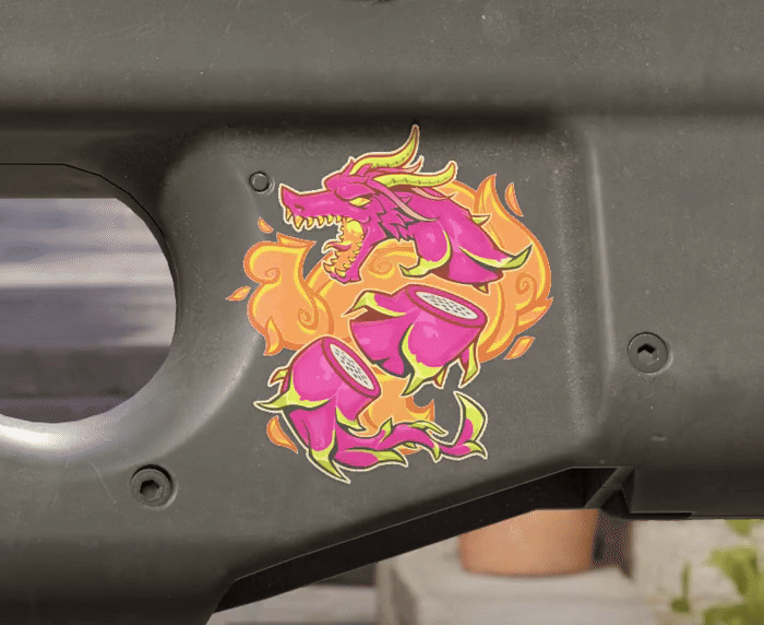
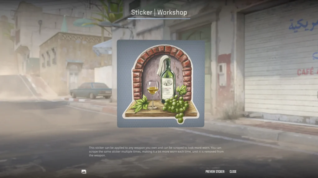
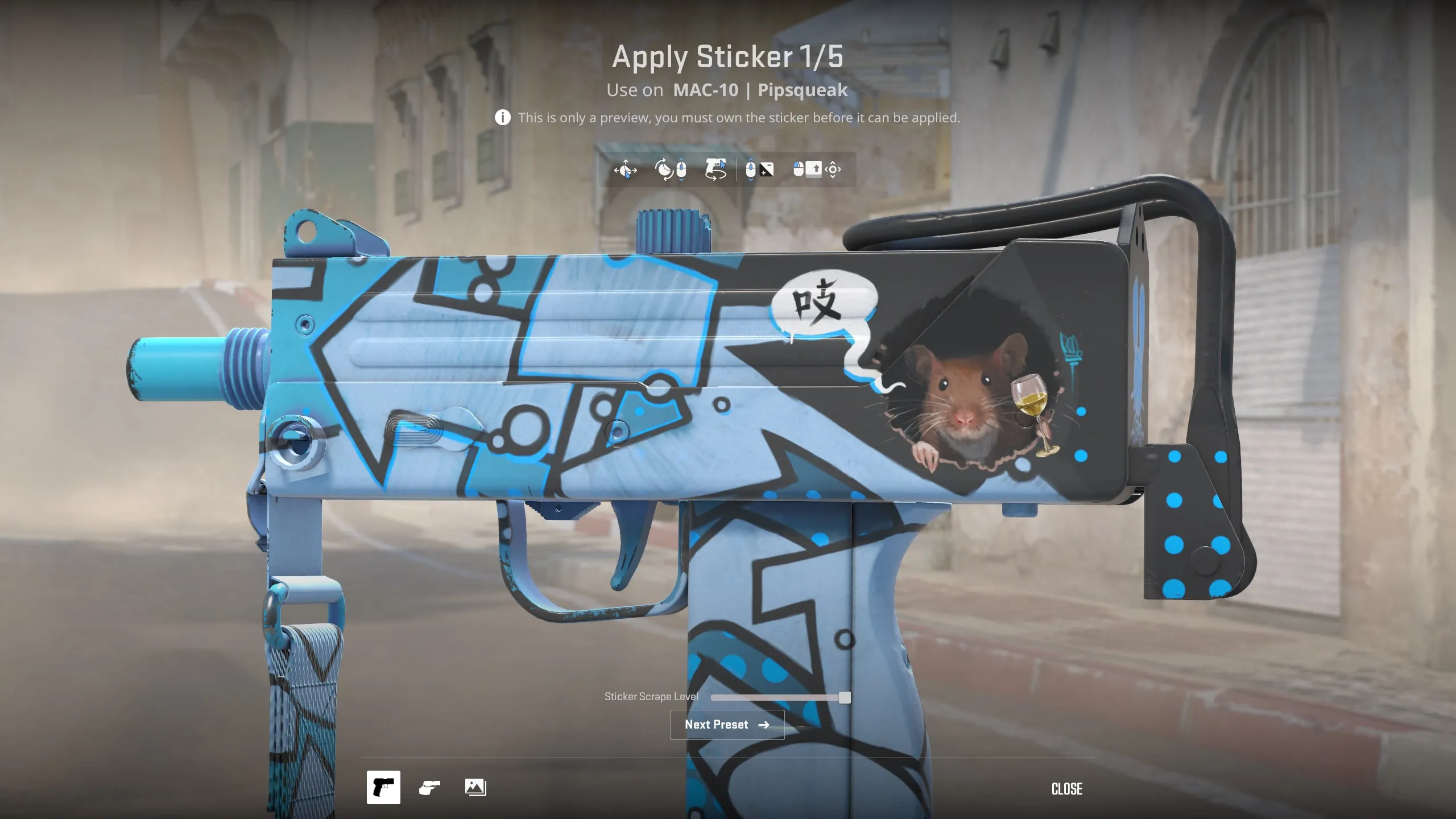
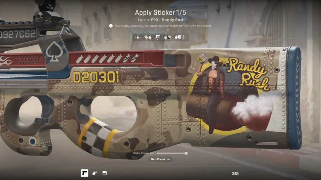
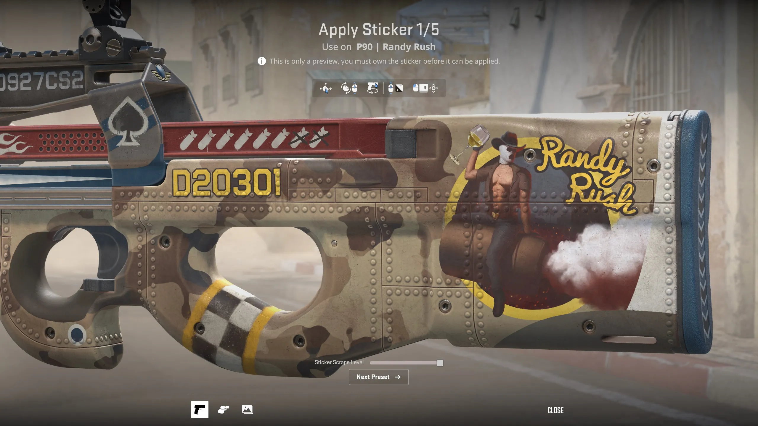
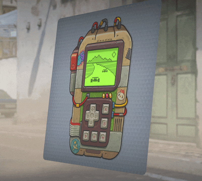
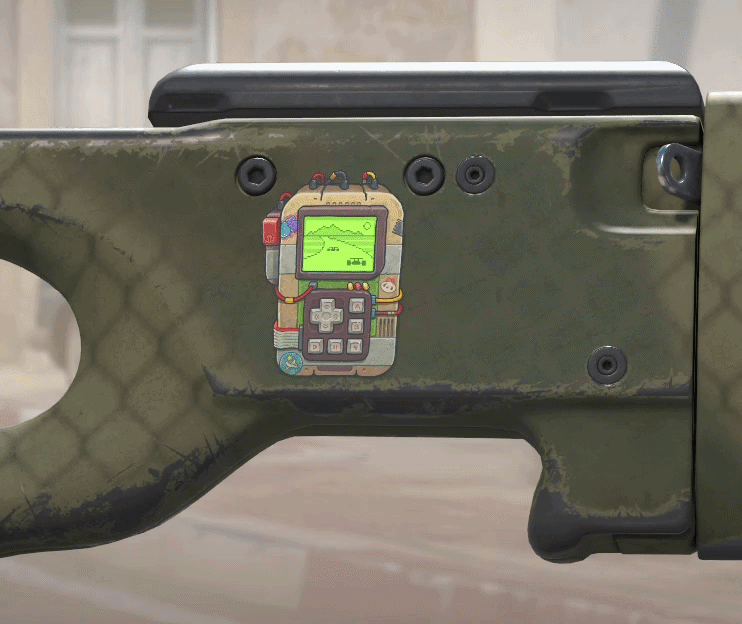
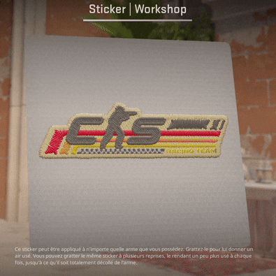
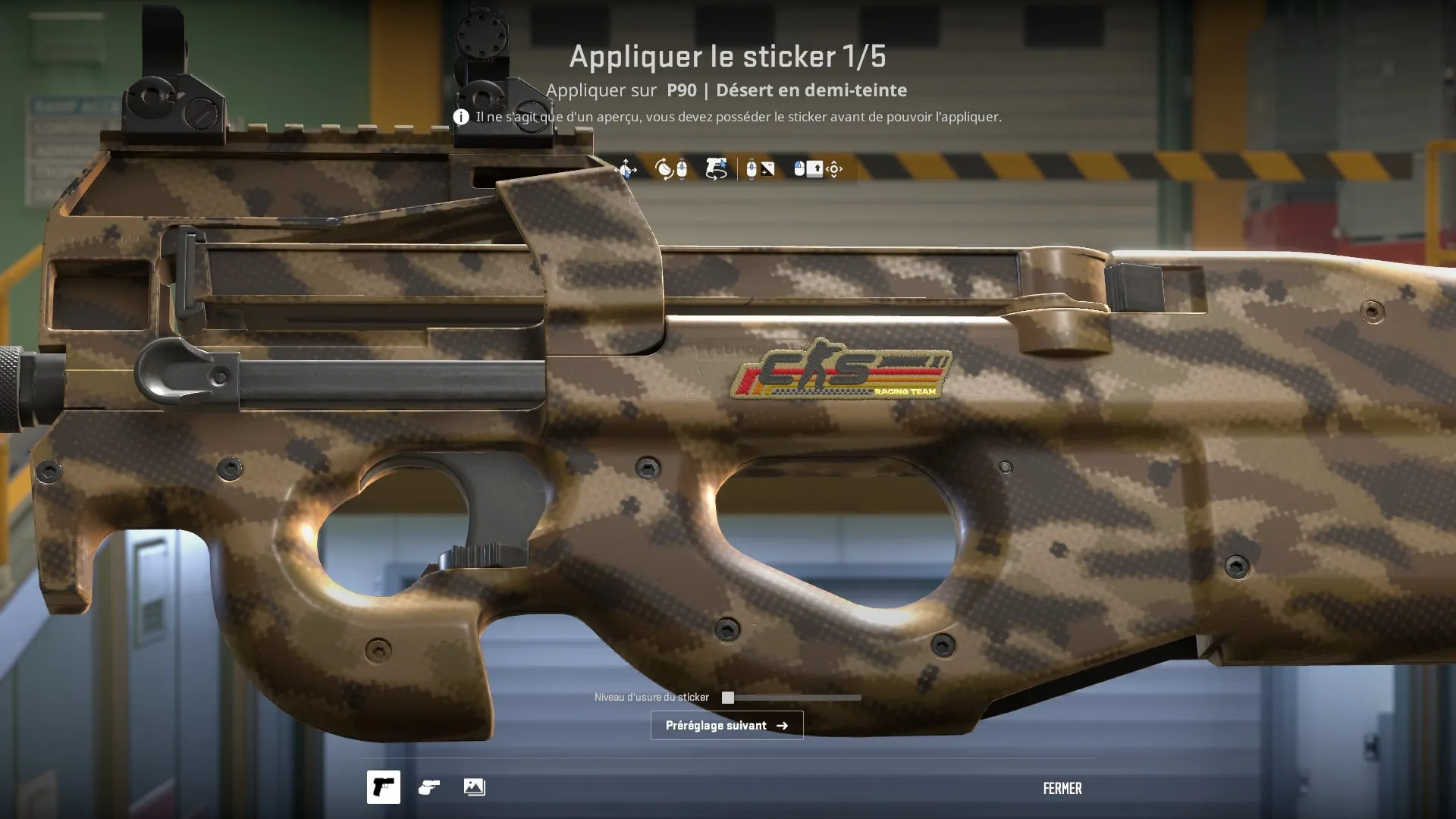
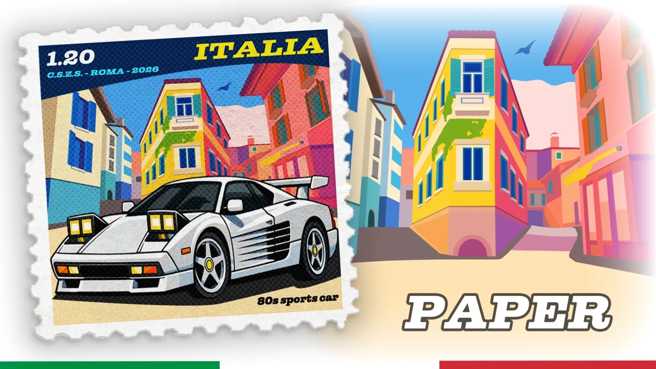
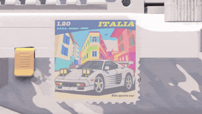
Stickers on the Theme of Racing and Fruits: 10 Works from the CS2 Workshop That Deserve to Be in the Game


Alex
Alex is an author and esports observer with more than seven years of experience. He specializes in analyzing new releases in the world of computer games, gaming services, and in-game economies. Alex shares practical experience and an expert perspective on the development of gaming, helping readers understand complex mechanics and stay up to date with the latest news.