Top 10 Pop Art Stickers from the Steam Workshop: Sticker Patterns and a Brand-New Chiaroscuro Style?!
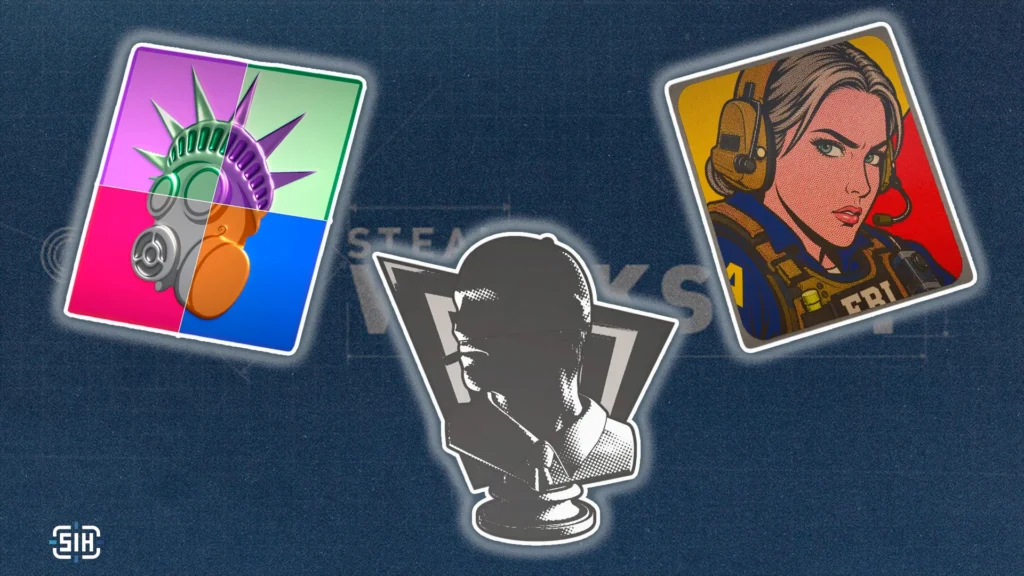
On July 16, Valve kicked off its second Call to Arms-ory and named three directions: the Fairy Tales weapon collection and two sticker sets, Cryptids and Pop Art. We’ve already covered the skins, so now it’s the stickers’ turn. We’ll start with Pop Art and come back to Cryptids in a separate piece, because the two themes are far too different to shove into one roundup.
Going in, Pop Art looked like the safest, most predictable theme of the whole contest: loud colours, hard contrast, comic outlines, halftone dots. You’d expect every submission to blur into the next one. It went the other way. This is where the artists ran the most interesting technical experiment we’ve seen across any Call to Arms wave so far.
Two storylines are worth putting up front. First: one of the artists built his own sticker style from scratch, Chiaroscuro, a mix of holographic and lenticular effects rendered entirely in black and white. Nothing like it exists in the game, and that’s a completely different order of ambition than another picture in an existing format.
The second storyline is a market one, and it matters more. Stickers are the last major item category with zero variation inside a print run. Weapons have had patterns since forever, charms got them recently and the mechanic caught on instantly, yet every copy of a given sticker is still identical to every other. One of the entries below makes a strong case that this needs to change.
So this isn’t only a roundup of pretty pictures. Half of what’s below is a pitch to change what a CS2 sticker even is.
Get Away Sally Pop Art (Paper)
- by ch3lios_
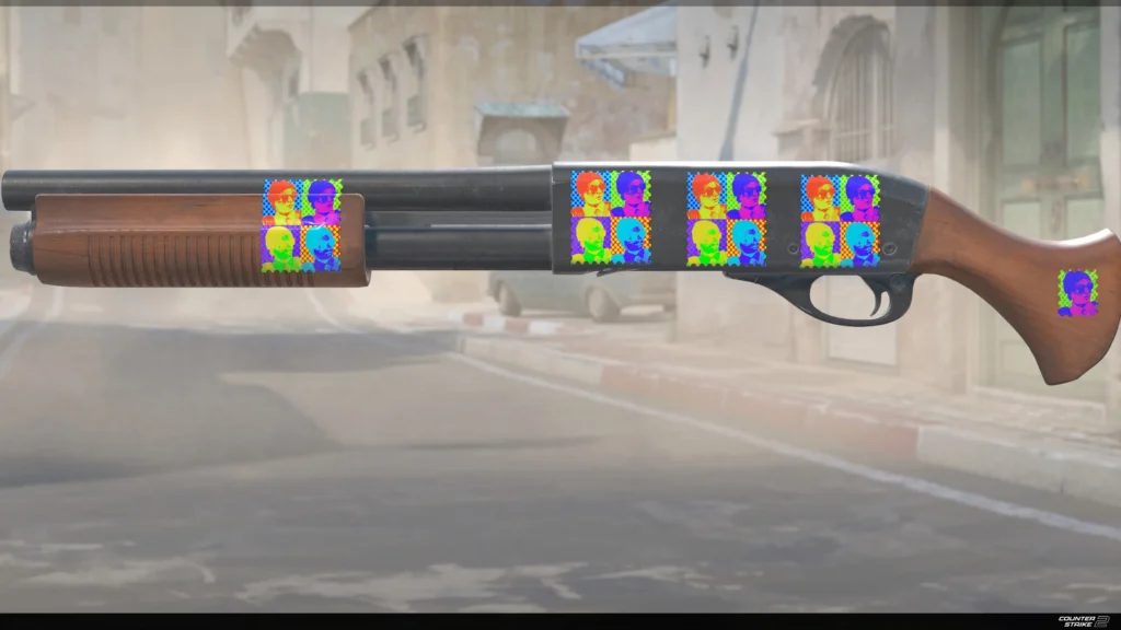
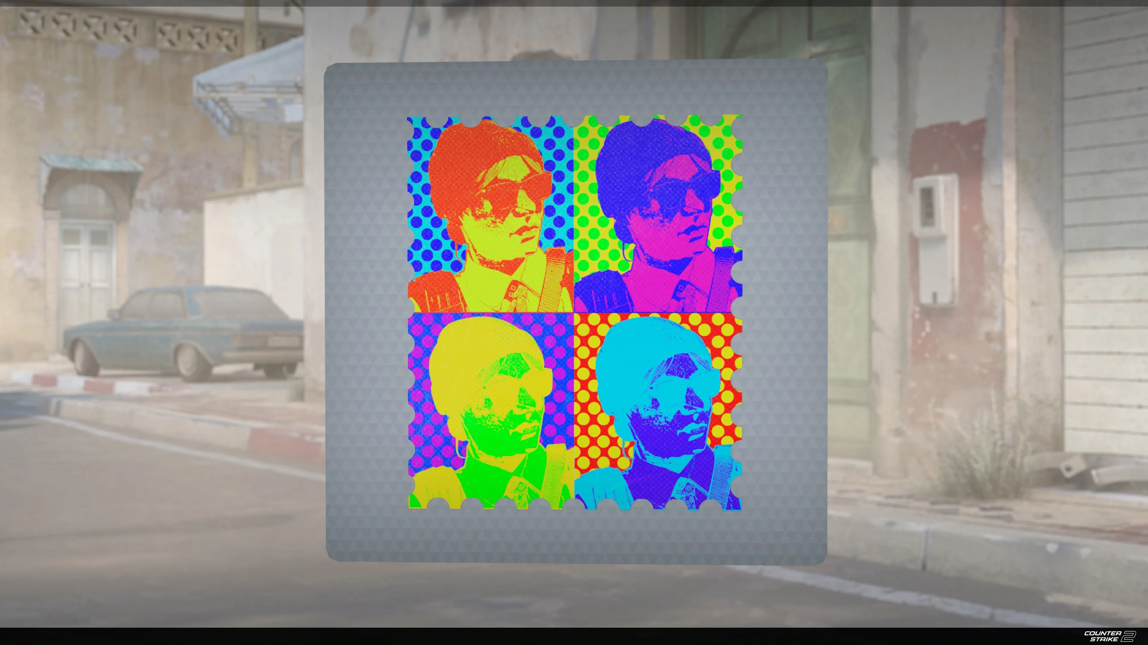
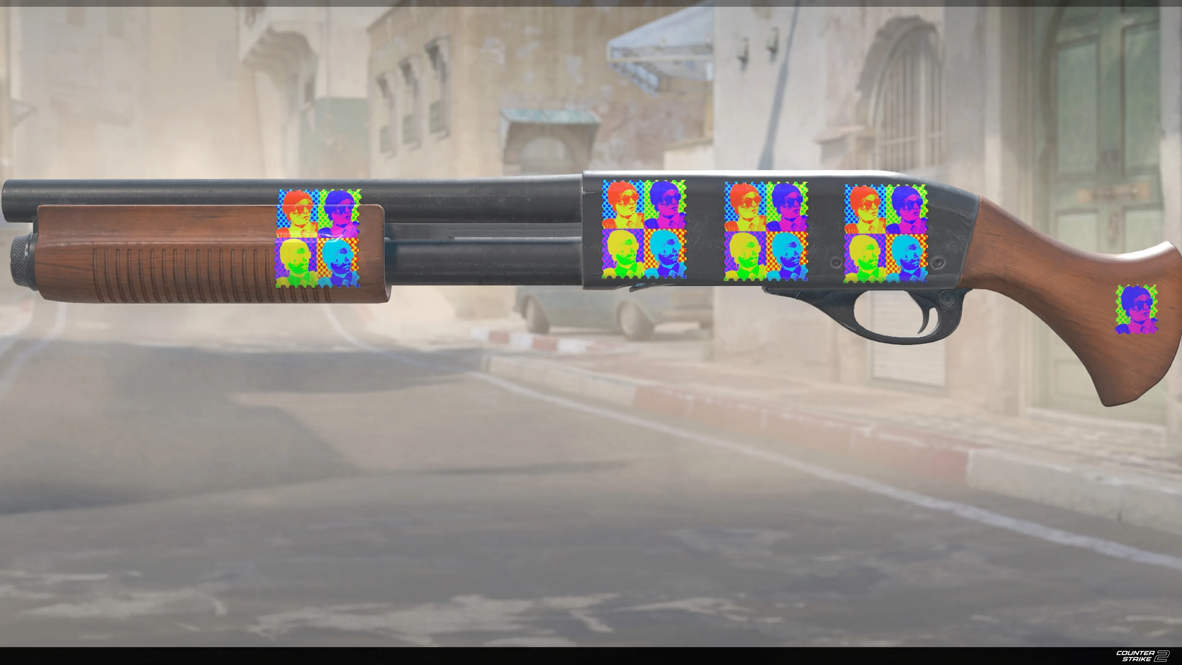
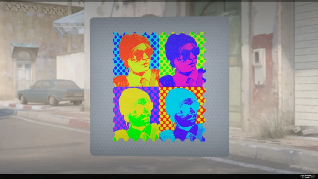
Exactly the image that appeared in everyone’s head the second Valve said the words “Pop Art.” Four repeating portraits of Getaway Sally in different acid palettes, lifted straight from Warhol’s Marilyn Monroe silkscreens.
There’s a closer-to-home association too: the era of the first filters and early Instagram, when everyone’s feed was the same photo run through the same recolour. That’s what pop art has always been about anyway, taking something mass-produced and repeating it until it turns into an icon.
Worth flagging that the artist is showing the paper version. Cheapest style, lowest barrier to entry, and zero loss in readability. The colours are dense enough that paper actually serves this one better than any glitter finish would.
Sticker | Art of Liberty
- by II
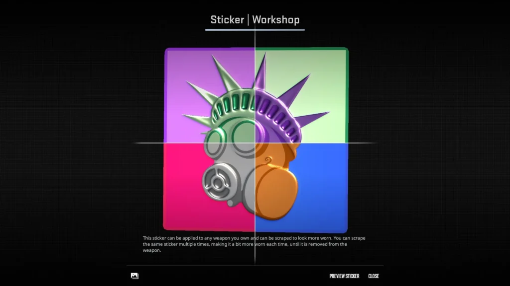
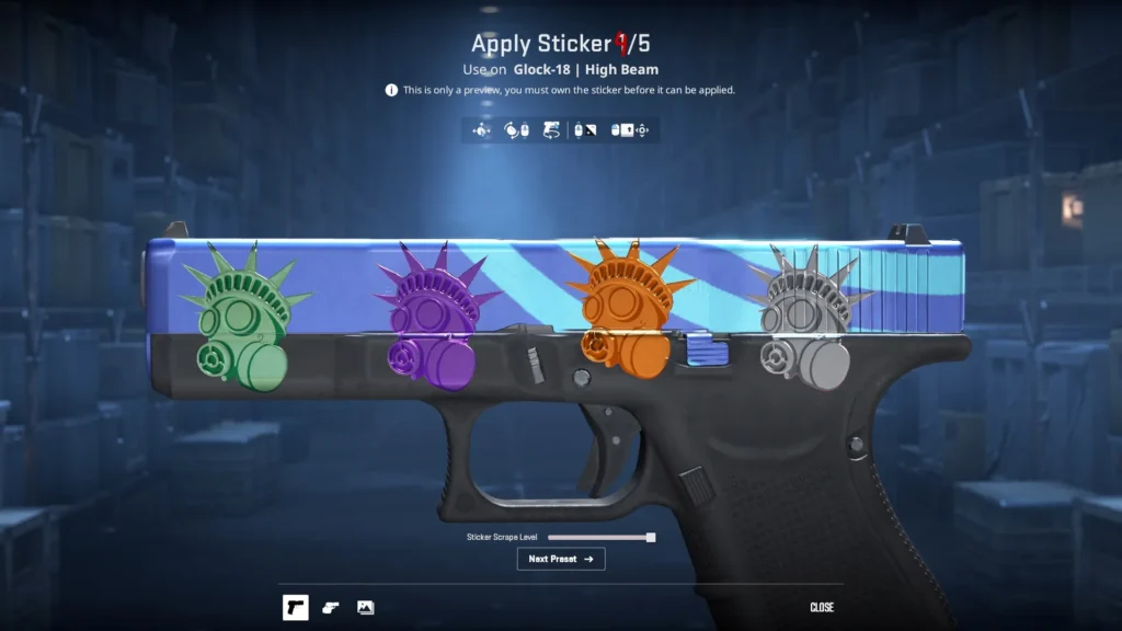
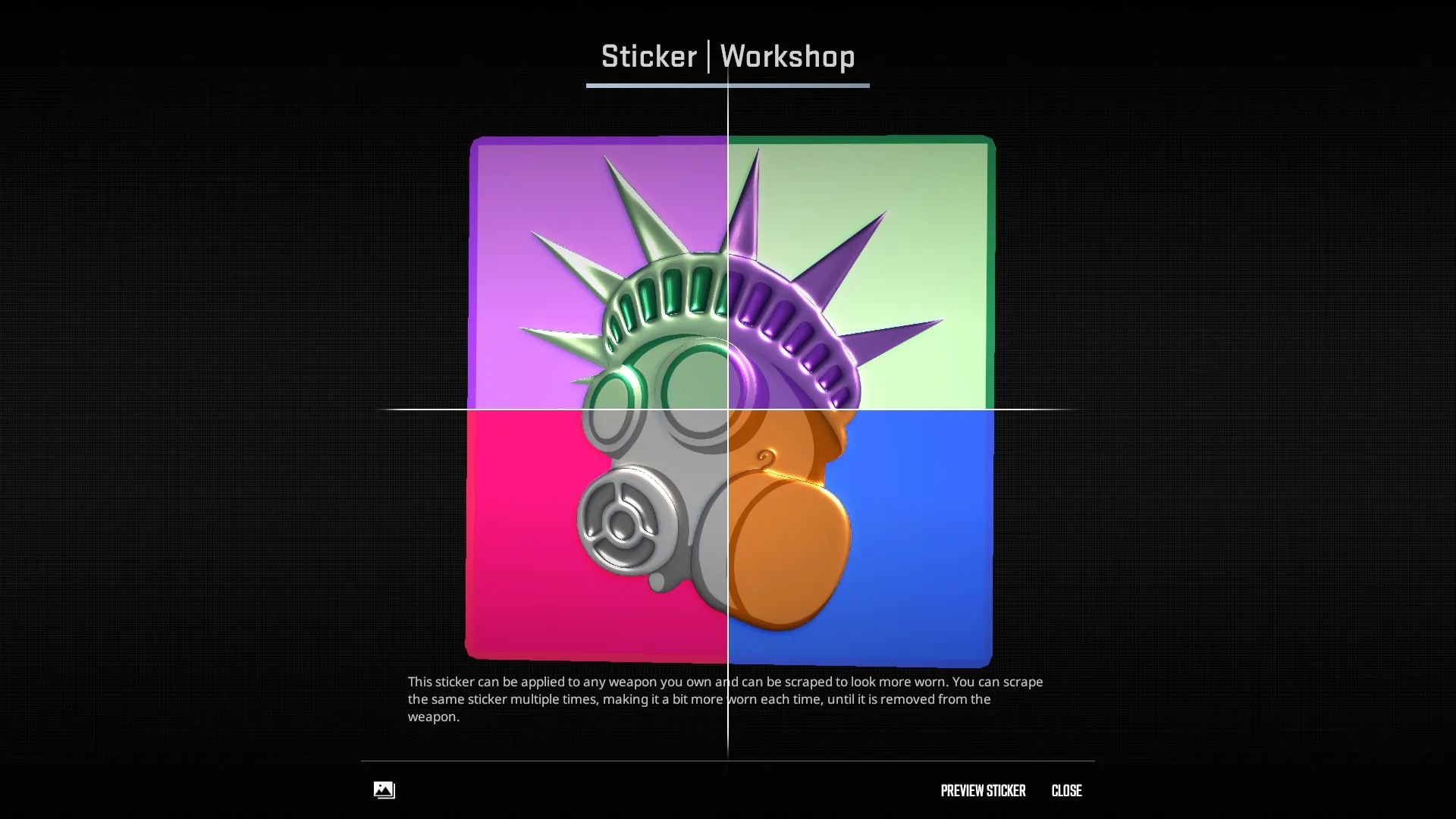
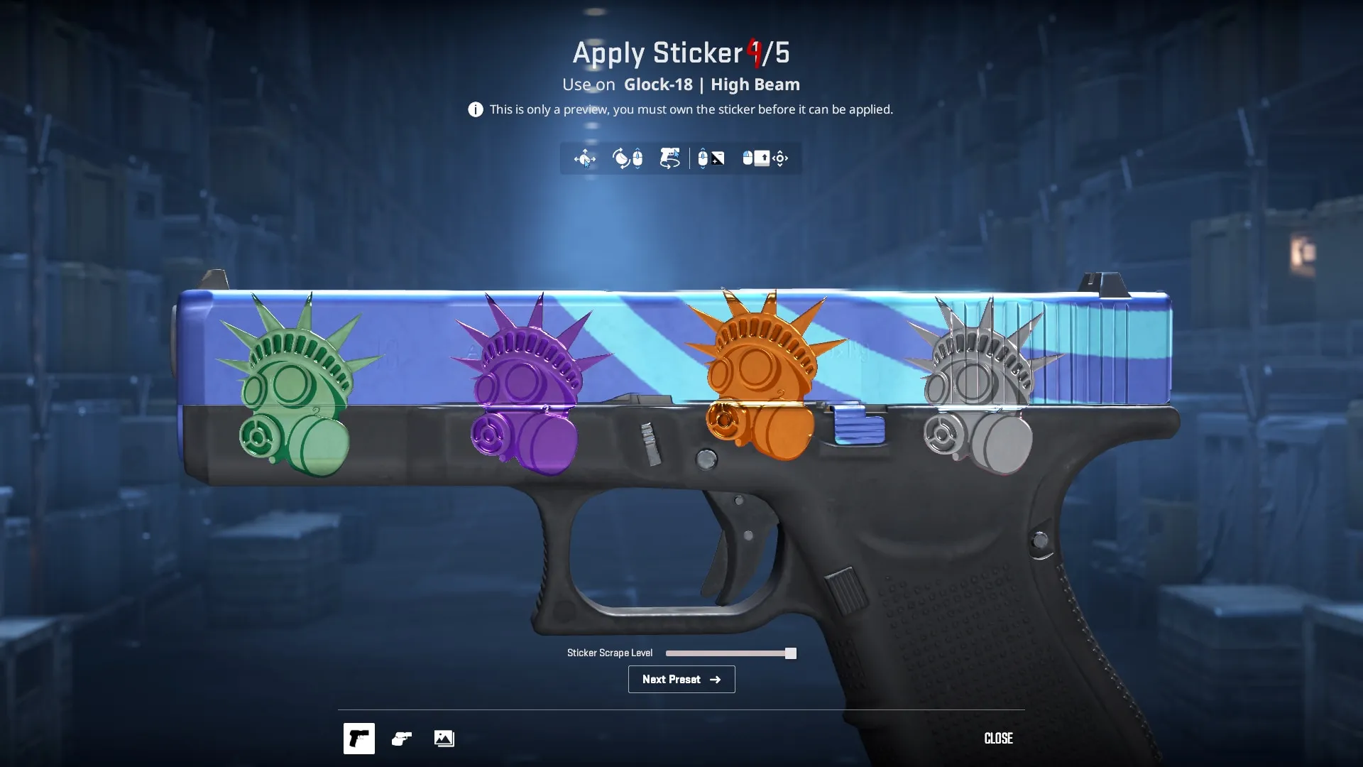
The Statue of Liberty in a gas mask, and Warhol’s logic again: he had his own Statue of Liberty back in 1962, and the same underlying principle of one silhouette pushed through different colour passes. The artist posted several versions here, green, purple, orange and silver. Lined up on a Glock-18 | High Beam in the preview, they look like a finished set.
This is the entry that got us thinking about patterns in the first place. The variants were submitted as options for Valve to choose from, but side by side they read like a ready-made palette for a single item.
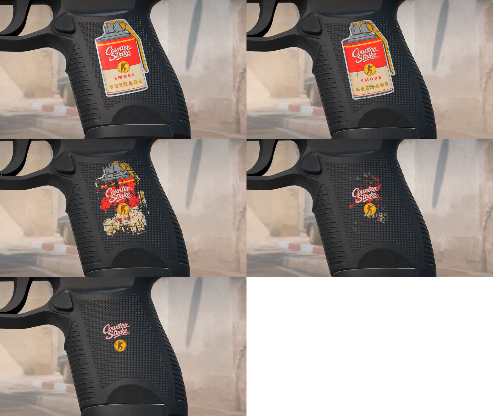
Picture the same sticker dropping in a dozen colour variations, some noticeably rarer than others. That instantly hands the sticker market the thing it’s been missing: the hunt, a price spread inside one item, and a reason to dig through other people’s inventories with extensions like SIH.
The other thing going for the mechanic is that it breaks nothing. Existing stickers stay exactly as they are, Valve keeps full control of the rarity curve, and collector value shows up in a place that currently has none. This submission reads like a polite hint, and we’d love for the devs to take it.
Professional_K | Lenticular
- by Milong
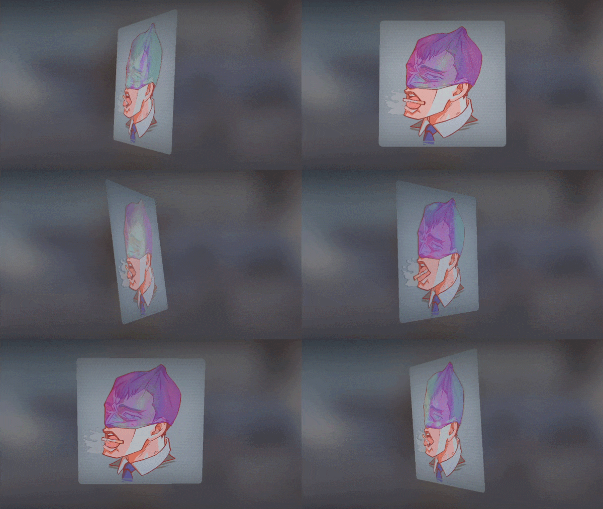
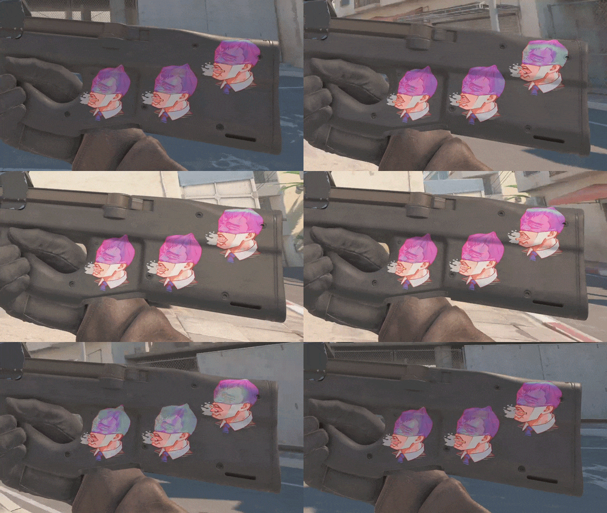
Lenticular printing is those shifting cards from childhood, the ones that came in gum packs and cereal boxes: tilt it, the picture changes. Mass-produced, cheap, printed by the million, which is precisely the soil pop art grew out of.
Here the agent rolls a cigarette between his teeth depending on the angle you view it from. Simple effect, but a properly moreish one. You want to spin this sticker in inspect, and on a gun it keeps doing its thing every time the camera moves. The tech is already in the game and Valve shipped lenticulars a while ago, so this comes down to selection and nothing else.
Muse_CT | Lenticular
- by Milong
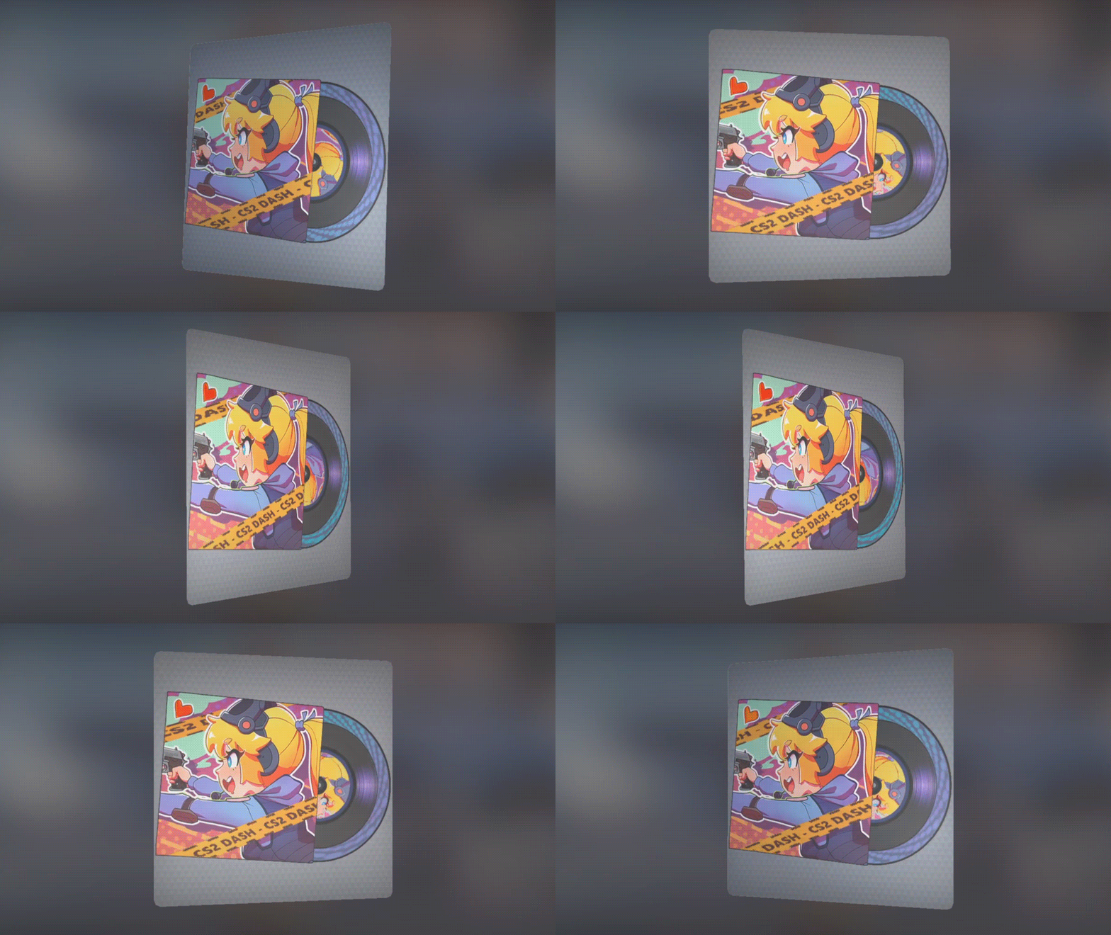
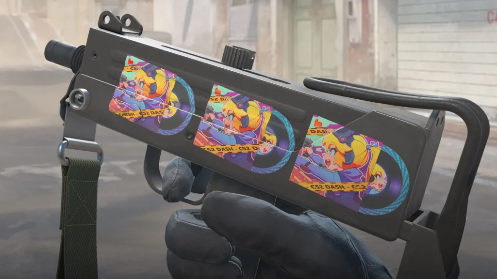
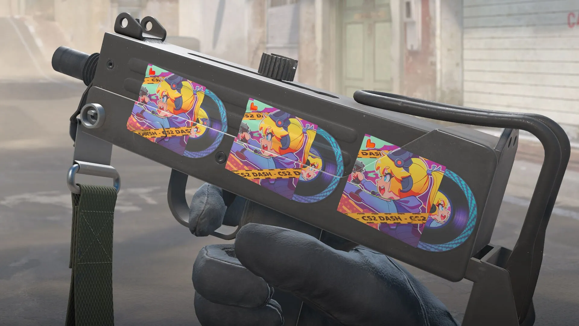
The same artist’s second lenticular, and arguably the better of the two. A vinyl record slides out of its sleeve with anime-style cover art and a CS2 DASH caption, and the disc itself spins as the angle changes.
The mechanic is a one-to-one match for the recent Sticker | Pineapple On Pizza, except there it was a pizza doing the spinning. Given Valve has already shipped one sticker with a rotating disc, they clearly like the animation, which makes the odds of a second one look genuinely decent.
vypa sista fan club (holo)
- by ticto
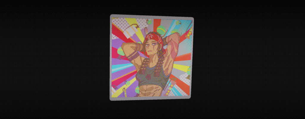
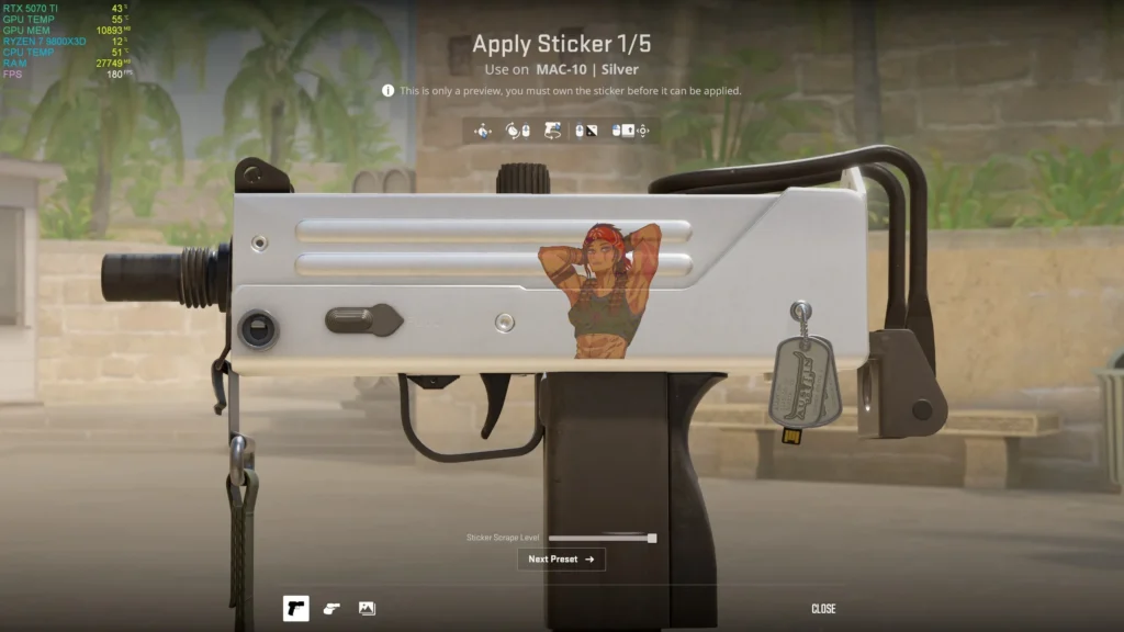
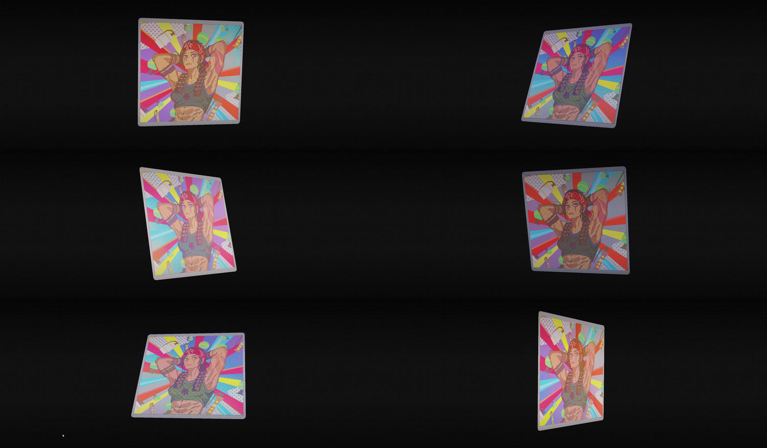
The collection would feel incomplete without something like this. Vypa Sista of the Revolution, relaxed, hands behind her head, sunburst rays and a scatter of halftone dots behind her, the instantly recognisable composition of sixties posters and fan club cards.
The name seals it. “Fan club” isn’t just a caption, it points at an entire layer of merch and print that got churned out by the tonne for teenage bedroom walls. The holo version works with that same story, adding a coat of cheap glossy shine, cheap in the best possible sense. A perfect example of hitting the theme without a single technical novelty: one composition, the right colours, a precise cultural anchor.
Sticker | Statuesque [Chiaroscuro]
- by Ezikyl
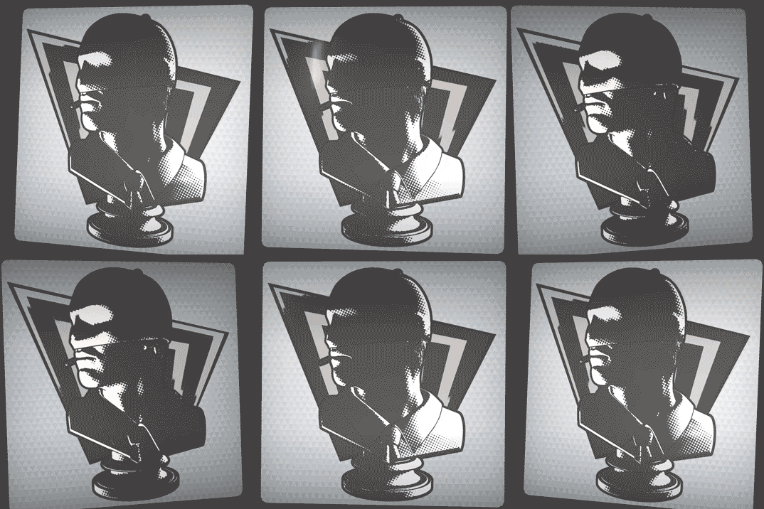
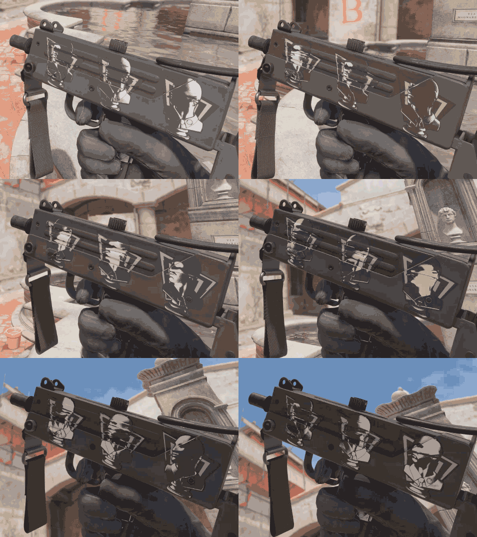
And here’s the headliner. Rather than pick from the existing sticker styles, the artist built his own: Chiaroscuro. Inside it sits a blend of holographic and lenticular effects, but held entirely in black and white. Light crawls across the surface, the image plays as you tilt it, and there’s no colour anywhere in the thing.
The name was chosen by someone who knows what he’s doing. Chiaroscuro is the technique of violent contrast between light and shadow, pushed to its absolute limit by Caravaggio. A classical bust run through a halftone screen is the exact gesture pop art was invented for: hauling high art onto the turf of mass printing.
The shape lands the theme too, with the angular rays behind the bust arranged like a comic-book blast. And yes, we’re fully aware that adding a new style to the game is a very different proposition from accepting a finished sticker in an existing format. But contests like Call to Arms-ory exist for exactly this. It’ll sting if Valve lets this one slide by.
POP Smoke | Sticker
- by ANNDM
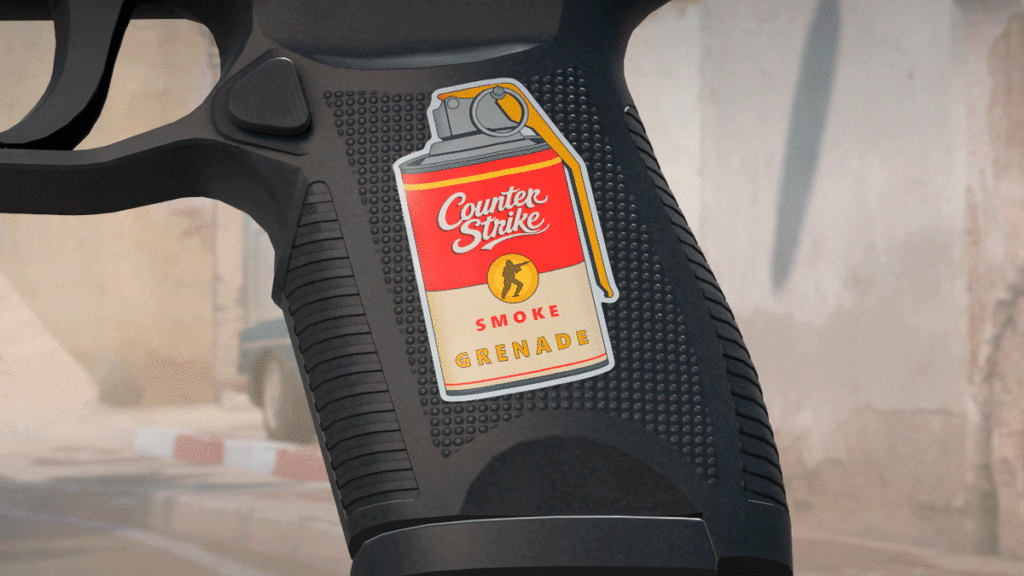
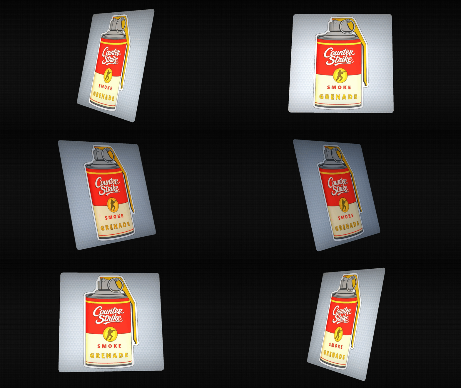
A Campbell’s soup can in the shape of a smoke grenade. If there’s a foolproof way to nail the Pop Art brief, this is what it looks like. Warhol’s thirty-two soup canvases from 1962 are the single most recognisable work the entire movement produced, and there isn’t a viewer alive who won’t clock it.
The execution is clean: the signature red-and-cream split, the gold band, the Counter-Strike logo set in that same script lettering, and SMOKE GRENADE where the soup variety should be. Nothing extra invented, and that’s precisely where the strength is.
There’s a pun buried in the name as well. “Pop smoke” is military slang for throwing a smoke grenade, so the Warhol nod and a literal description of the item land in the same two words.
Sticker | I'll be back [Holo]
- by SHAFT
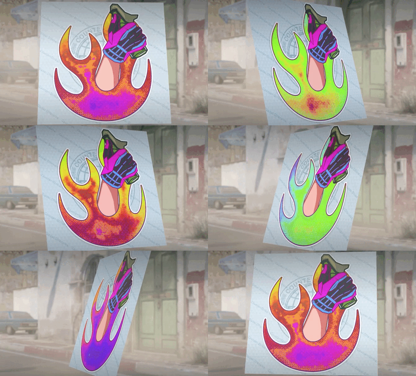
A gloved hand rises out of the flames with a molotov where the thumb should be. Two of the most reproduced scenes in the franchise are mashed together here: the “I’ll be back” line from the first Terminator and the ending of the second, where the T-800 sinks into molten metal giving a thumbs-up.
Pop art has always lived on this exact territory, working with frames that mass culture has already worn down into symbols. The holo treatment fits too, since fire on a shifting iridescent backing looks considerably more alive.
STICKER | 'The Doctor' RomARTov - Bubble gum
- by Evgen 70 reg
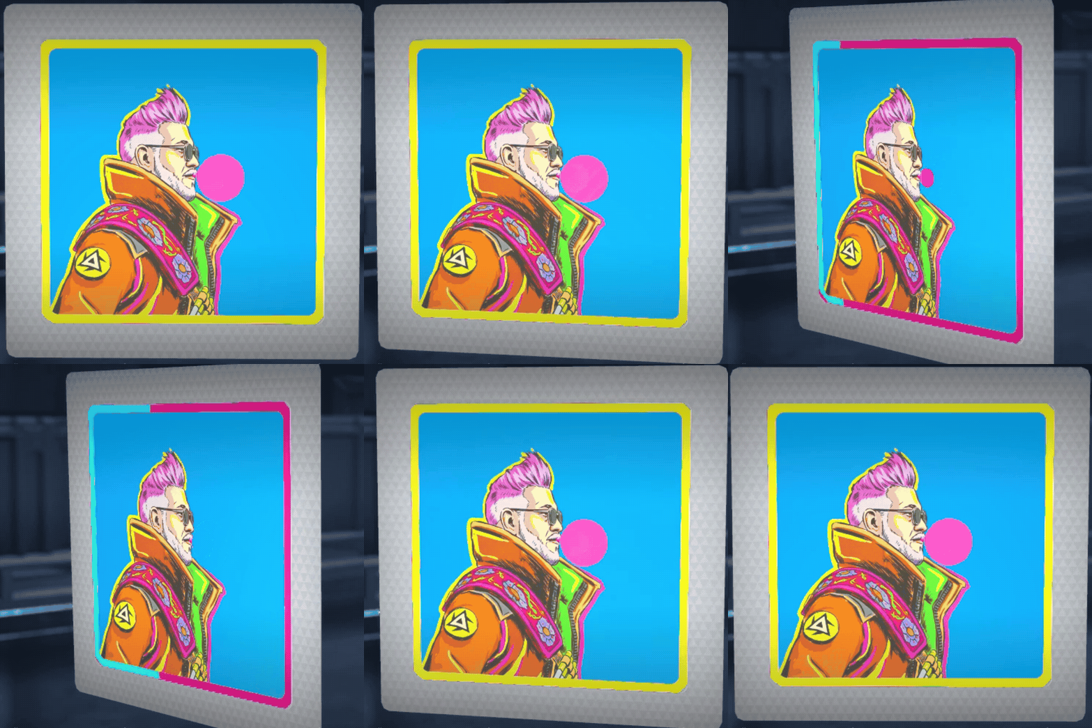
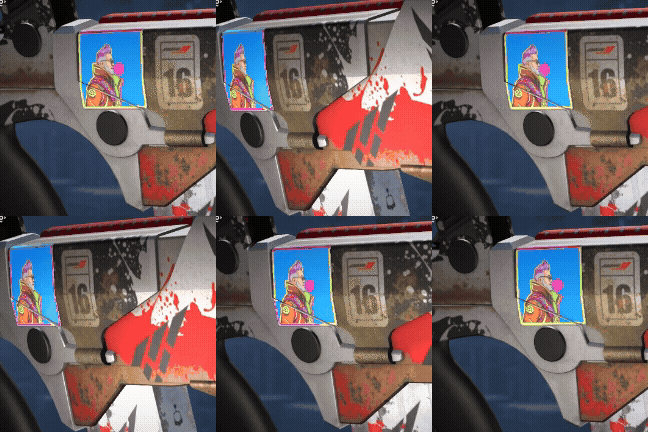
Another technical find. The agent blows a bubble while a highlight travels around the sticker frame, shifting with the refraction. A small thing, but small things like this are what make you spin the gun in inspect one more time.
The pun in the name is good too: ‘The Doctor’ Romanov becomes RomARTov, with ART sitting dead centre. The gum isn’t a throwaway detail either, it points straight at the physical foundation the whole movement stood on. Pop art grew out of the same cheap printed junk kids bought with pocket money, gum wrappers and trading cards included. The colour scheme runs on the classic cyan, magenta and yellow triad. Taken as a whole, one of the most complete pieces in this roundup.
Sticker | Pop Special Agent Ava
- by S0ur
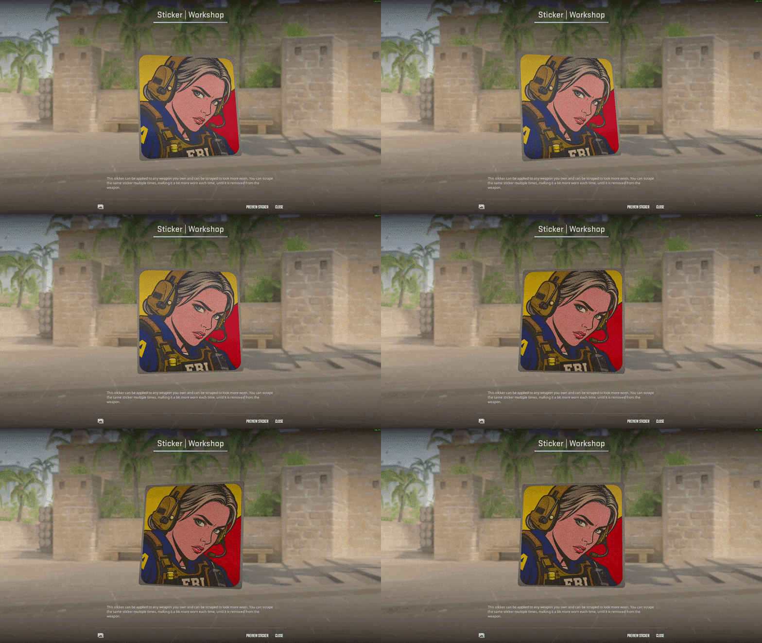
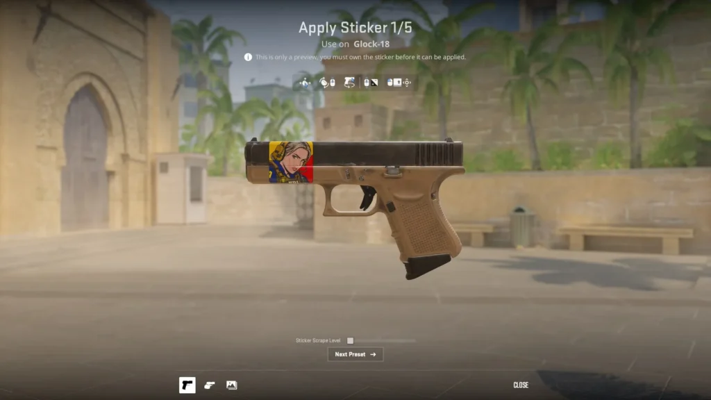
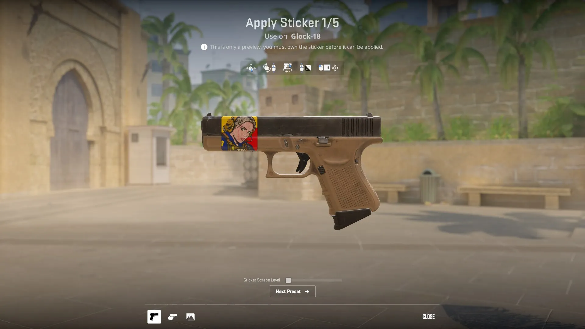
We’ll close with a submission that gets everything right without a single new mechanic. Special Agent Ava in an FBI vest, presented as a panel from a sixties romance comic: heavy outlines, halftone dots across the skin, flat red and yellow blocks in the background, a bold composition with no fiddly detail.
That last part is what decides it. A sticker lives on a gun at a couple of centimetres across, and anything finely detailed turns to mush at that size. Here the face reads from a distance and the colours don’t fight each other. Design, shape, palette, style, it’s all there.
These are the stickers Valve usually takes, the ones that hit the theme dead on and ask nothing of the engine. The experiments are more fun to follow, but collections get built on work like this.
Alex
Alex is an author and esports observer with more than seven years of experience. He specializes in analyzing new releases in the world of computer games, gaming services, and in-game economies. Alex shares practical experience and an expert perspective on the development of gaming, helping readers understand complex mechanics and stay up to date with the latest news.